
Crowns to the left of me, a Joker to the right. Here I am, stuck in the middle of a review.
England’s own Golby Watches have been making a name for themselves in their home country, but also in the global microbrand scene. They’re fully involved. Attending events across the world and posting on social media regularly, but it’s their watches that have been doing the loudest talking.
They started out confidently with the Aquareef, a smart-looking diver with a clever rotating internal bezel (for tracking a different timezone) and a detailed, attractive look that would set the tone for their design language moving forward.
There was a lot to like about the Aquareef and not many issues. The price was maybe a little high for a Seiko NH35-powered watch, but that was tempered by an early bird discount anyway, and so the watch ended up being quite the success (and is now sold out).
They followed it up with the Coastal, which we reviewed, and it remains one of my top three pieces. A guaranteed ‘never selling it’ watch that finds itself jumping the queue in my watch rotation very often. If I want something stylish, compact, versatile, sporty, dressy. The Coastal somehow just always manages to qualify, regardless of the criteria for that day.
It shared plenty of design DNA with the Aquareef. The detailed, oil-pressed dial, the confident colours, the crispness of the case shape, but added even more confidence with a seaside theme that packed in many clever touches, but without any of the ‘Quick Me Quick’ hatted corniness of our seaside memories.
These days, the world is gearing up for the release of the Skipping Stone, Golby’s fourth watch and one that’s looking to be a stunning reflection of everything they did with the Coastal. We can’t wait, but we’re going to have to. Never mind, though, because in the meantime, we’ve got our hands on Golby’s third effort.
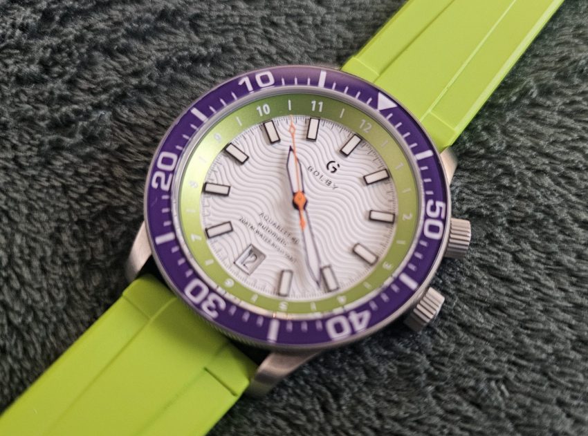
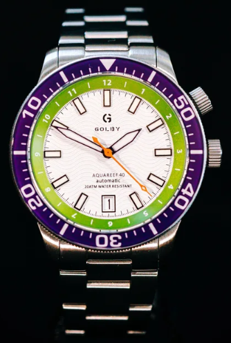
Released in the latter half of last year, the Aquareef 40 saw Golby return to their first watch and while that might have seemed like a strange choice, and something of a safe one considering how bold the Coastal was, when you finally get to try the watch out, you’ll realise that this is far from just a simple revision.
The 40 in the watch’s name refers, of course, to the watch’s diameter. A single millimetre smaller than the original Aquareef. The case is actually 39mm, but paired with a 40mm bezel, which means you get a slight overhang that aids with grip. The Coastal was a 37mm watch, its slighter proportions delighting me and my frankly bullshit wrists, but for a diver, you need a bit more dial real estate to play with, so the 40mm size is completely appropriate for a tool watch like this.
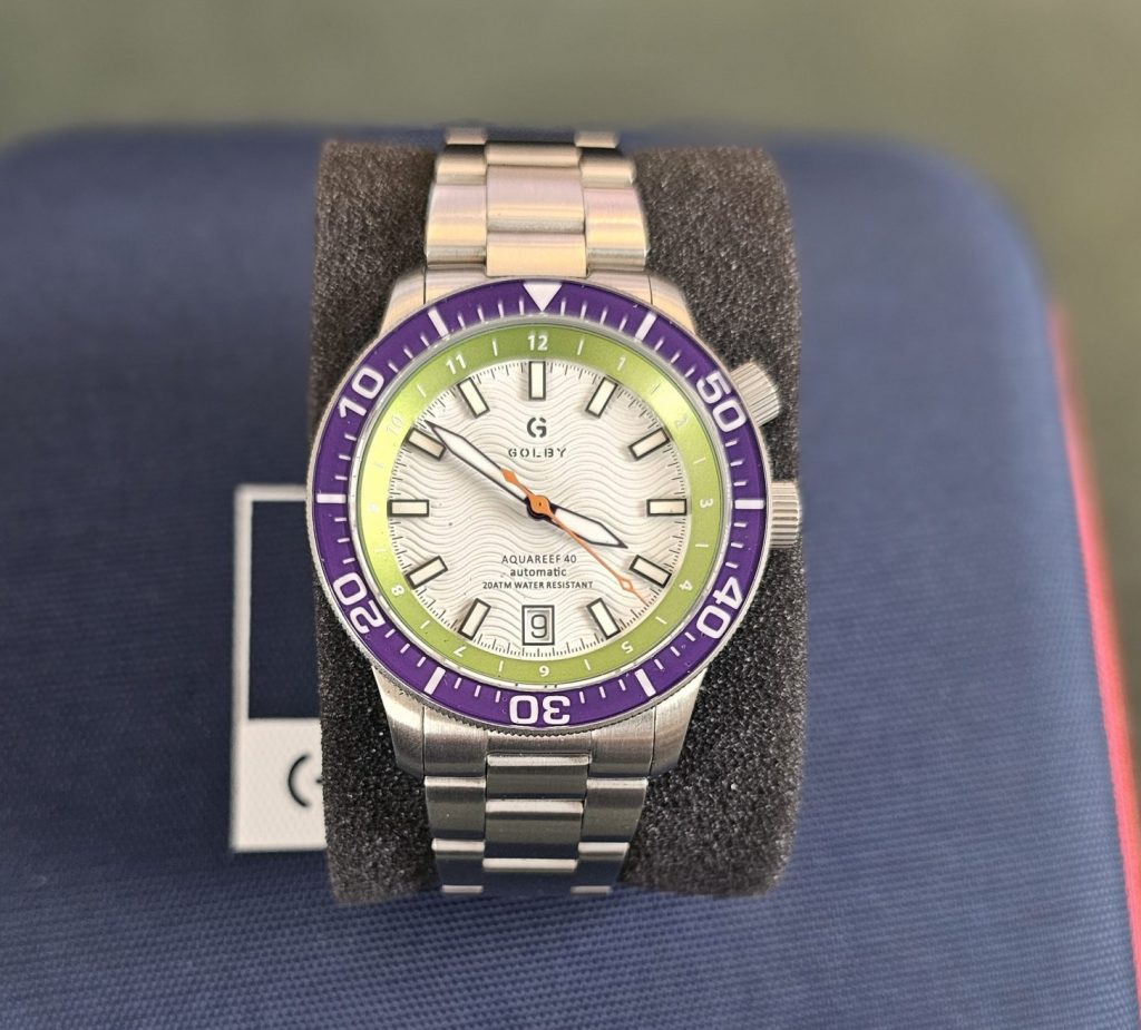
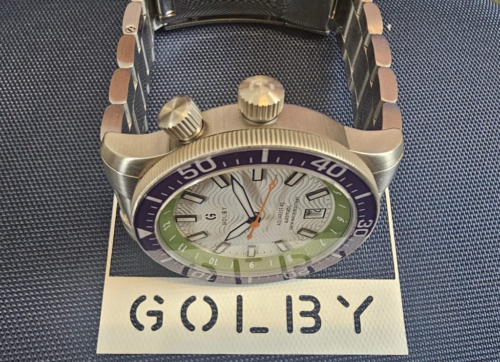
The dial keeps the same wave pattern texture as the original Aquareef and the Coastal, and it’s almost aggressively textured. There’s no subtlety to it. You put this watch on Instagram, you’d better pick Wave of Mutilation as the backing music because this is one dramatic dial, and we love it. We loved it on the Coastal, but here in white it’s even more dramatic with a depth that almost makes it look as if there are black lines in with the white oil-pressed dial (a process where a malleable material is shaped under high pressure using oil).
One of many refinements over the original is the logo. The plated G/Golby from the original is now directly printed, losing the plate and giving a more subtle look to it all. That’s a direct lift from the Coastal, but it’s clearly the way forward as it looks much better.
In the bottom half of the dial, you get the same details as before. The watch name (now updated from Aquareef to Aquareef 40), ‘automatic’ and a reference to the watch’s water resistance rating.
Interestingly, the date window has been shifted from the original’s 3 o’clock position to 6 o’clock. We’re generally happy with either, but fans of symmetry will consider this an upgrade of sorts. If we’re really being niggly, the date can sometimes be a tiny bit off-centre in the window. To be honest, we see this all the time from microbrands, and we’re currently trying and failing to get our new Phoibos sorted (which has a more aggressive lean to the left). Honestly, it’s barely an issue here, but the most OCD of buyers might see it as a problem (also, unlike Phoibos, we’re confident that Golby will rectify any faults).
A set of eleven raised baton indices sits on the dial, giving a unified look which seems to be quite rare these days. We’re used to seeing mixed indice layouts, or at least the 12 o’clock position getting a double baton or whatever, so we’re actually very pleased with this design as it just looks exceptionally clean. The positioning of the applied indices is decent enough and the overall consistent look is very appealing, giving the watch a solid, ‘no fuss’ look.
The watch keeps the same sword hands as before, but now uses a contrasting colour for the seconds hand where it was colour-matched (to the inner bezel) before. This time the white dial and black outlined hands are complimented by an orange seconds hand, itself a contrasting colour to this watch’s green inner bezel. It’s a cool touch and, again, something of an upgrade as it offers a bit of visual interest and improves readability a smidge too.
The inner bezel keeps the same metallic shine as the original Aquareef and the Coastal. It looks great adding both a great pop of colour as well as some textural contrast. It also has some utility as it has hour markers printed on it. Now, you could just have it set up to your local timezone, or you can use the upper crown (placed at 2 o’clock) to rotate it internally, making this a perfect watch for tracking two timezones. Brilliant if you’re the sort of diver who likes to head off to exotic places. Who do you think you are? James Bond?
The outer bezel is a more typical dive-style ceramic affair. As with the Coastal (and original Aquareef), the watch uses a countdown bezel rather than a typical dive bezel. Your mileage might vary, but we’ve seen Jaws and The Abyss and so a countdown bezel works perfectly for us. Essentially, the difference is that while both types generally turn anti-clockwise, a dive bezel has the numbers counting up in a clockwise direction and measures time elapsed where as a countdown bezel like this counts down clockwise but tracks time remaining.
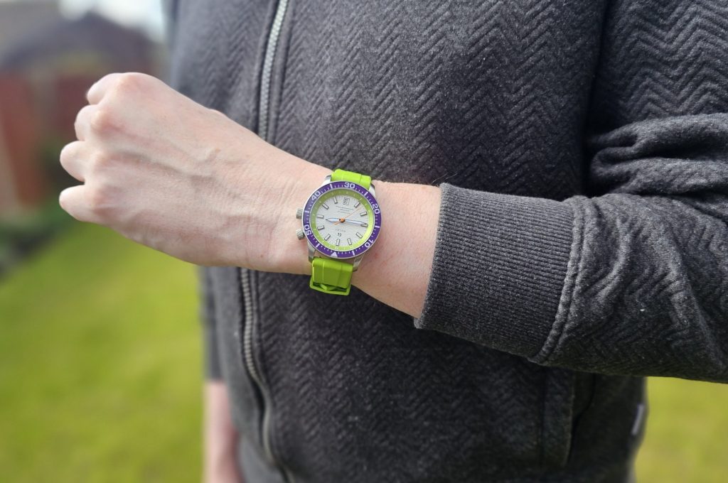
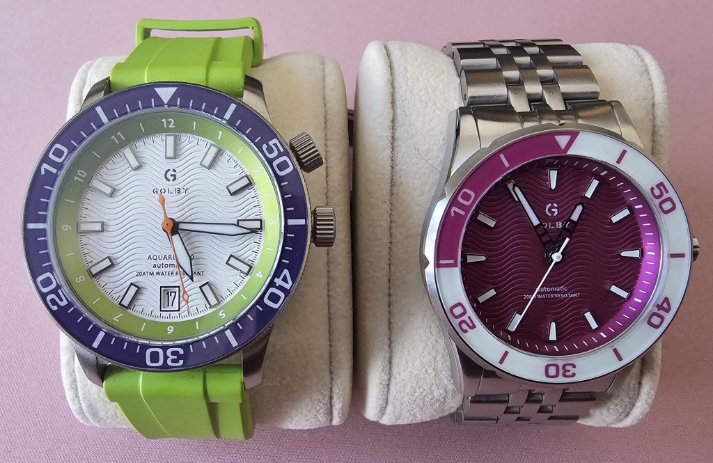
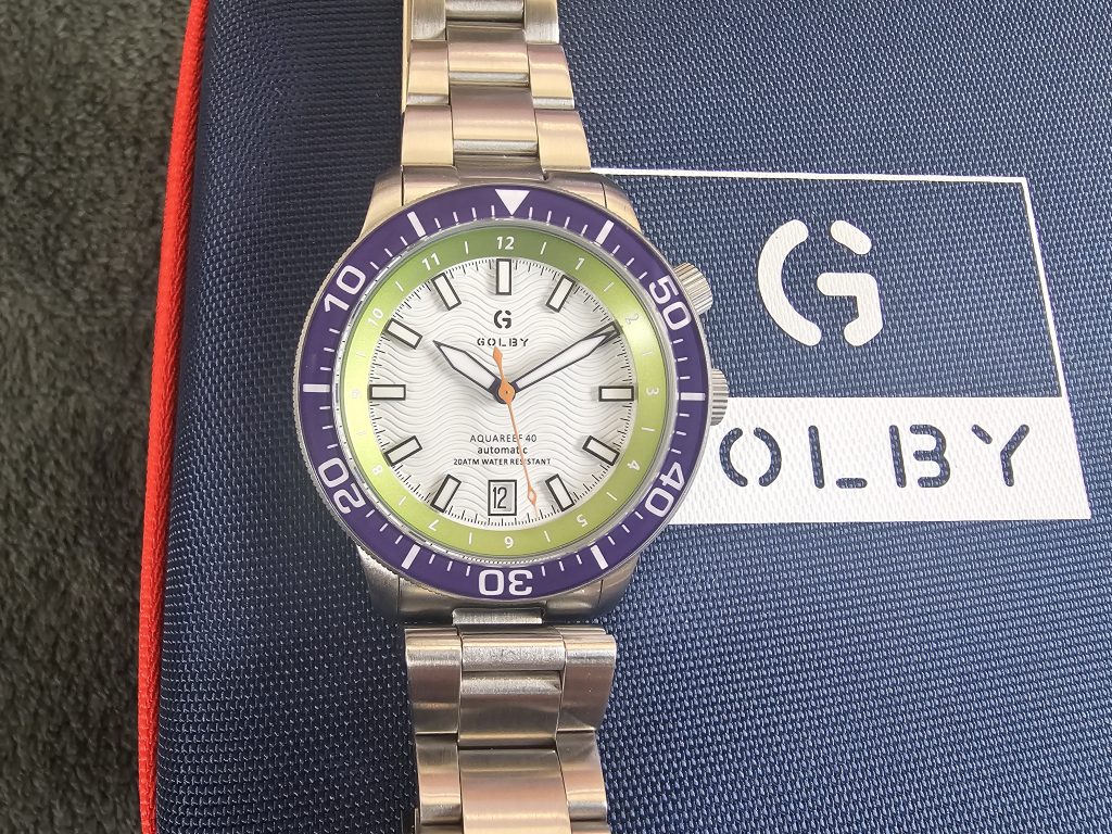
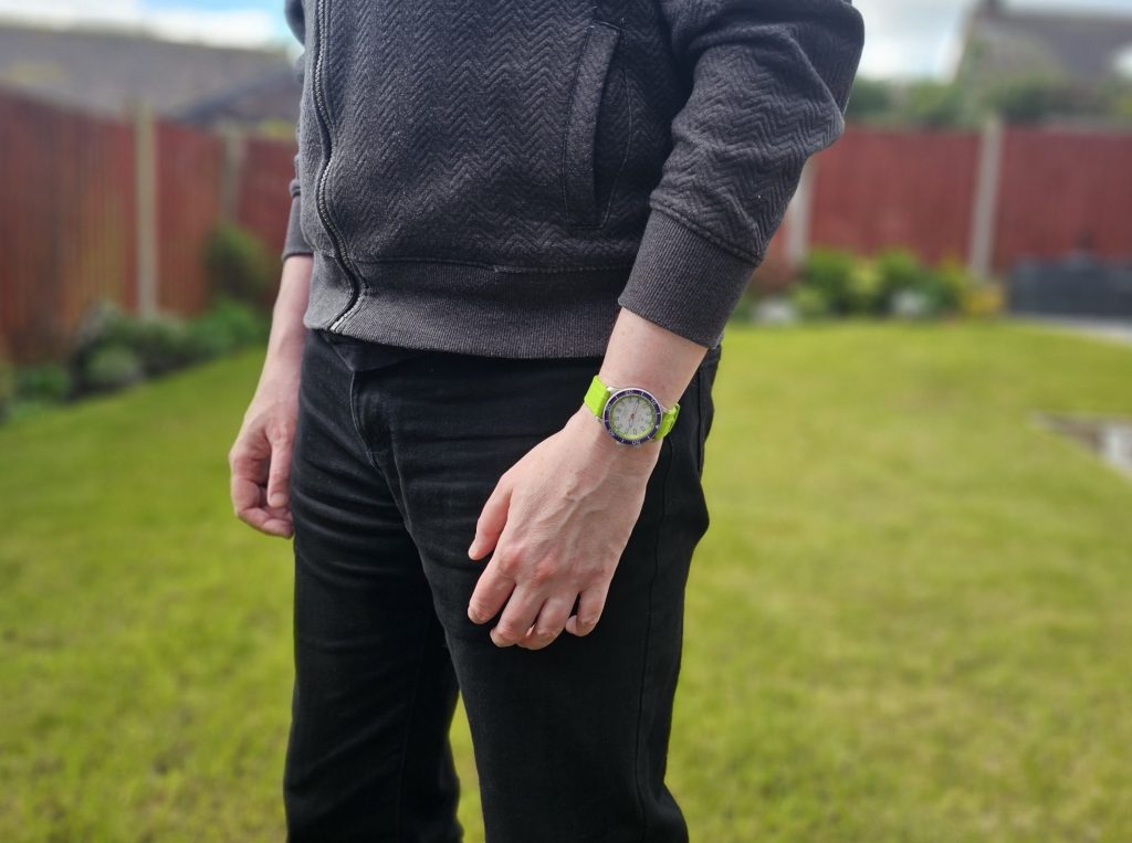
The bold purple on the bezel complements the green inner bezel perfectly with that green/purple/white colour-scheme (say no to ‘colourway’) earning this particular variant its nickname ‘The Joker’ which is perfect for it (although The Hulk, The Wimbledon and The Pickled Onion Monster Munch have all been suggested too). It’s just so stunning. Bold, immediate, flashy. The watch could have almost been overwhelming but the details on the dial and bezel help to temper that. Yeah, this isn’t a watch that hides away but it’s not a pile of Richard Mille vomit on your wrist either. It’s confident but not a dick about. The Golby Aquareef 40: Not A Dick About It.
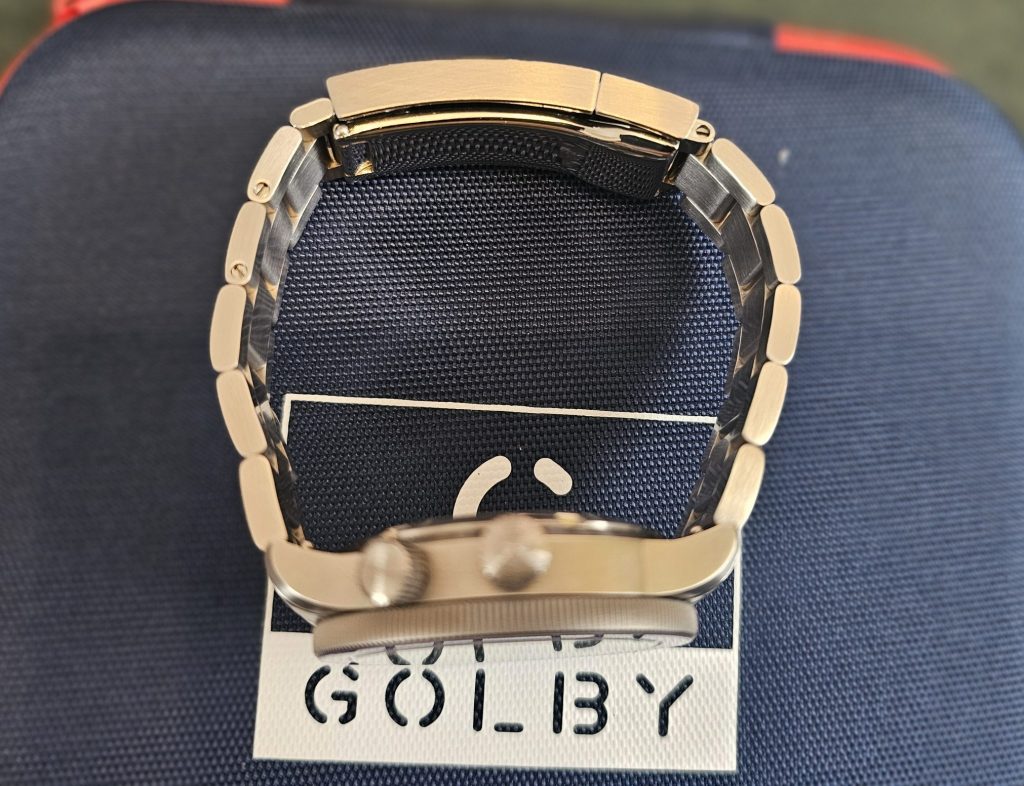
Below the bezel, the case plays an important supporting role to all that deliciousness up front. The sides of the case sport a subtle brushed polish, just helping to offset the watch’s boldness. That said, the two crowns do also add a bit of visual interest, too. The one at 2 o’clock is slightly smaller, whereas the main operating crown is also signed (which is slightly cooler than if they were both signed, if you know what we mean). And the case actually gets a more significant reduction in size, with the original lug-to-lug of 50.5mm now being slashed down to 47mm, a welcome reduction. The thickness is also down from 13.1mm to a much more versatile 11.5mm, giving this watch an almost dressy appeal.
This drop in dress sizes is thanks to the Aquareef 40’s most important upgrade. Gone is the Seiko NH35a, which has now been replaced with our favourite Miyota 9015. Aside from being a slimmer movement, it also offers up a smoother sweep (28,800vph rather than the original’s 21,600), better accuracy and an extra hour of power reserve. It’s a tiny bit louder than the NH35a, but we’ve never once been bothered by the sound of a rotor because we’re not insane.
It’s a really intentional upgrade. One that says ‘we’re stepping this thing up’ and aside from just being more premium overall, it’s also allowed Golby to increase the water resistance from 100 meters to 200, which isn’t to be sniffed at either.
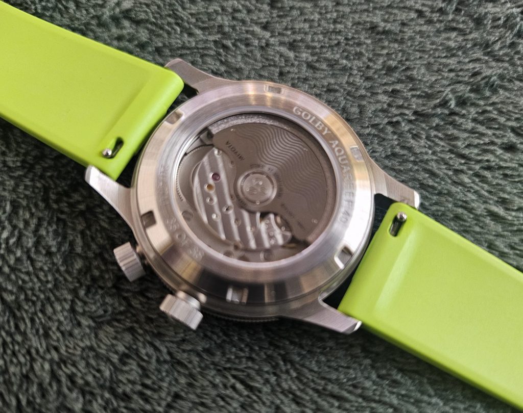
As with the original, an exhibition caseback lets you see what’s going on in there. While not as decorated as other watch movements that we’ve seen, the rotor sports the same wave pattern as the dial, but they’ve removed the ‘Golby’ branding from it that was seen on the original watch. This is pretty smart as it shows that Golby know when to brand and when to chill. Anyway, you get their name and the name of the watch, inscribed around the window along with the depth rating and, excitingly, the edition number of the watch. This one was 35 of 38. We know it’s all a bit arbitrary, but shit like that is cool, and we’re always going to be marks for it.
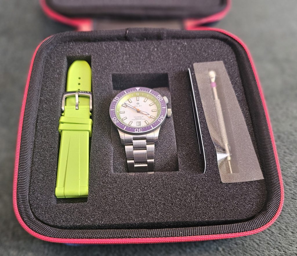
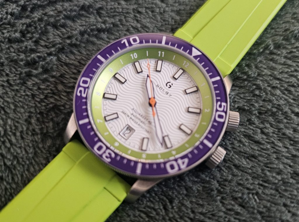
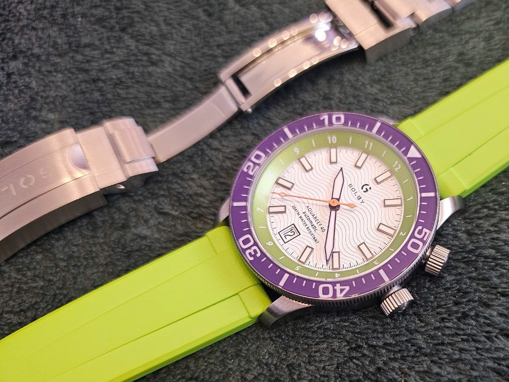
In the box, you’ll actually have a choice between a steel bracelet and an FKM strap, allowing you to switch up your look. Now, apart from the first day, we’ve never worn the Coastal on the complimentary white strap and have always stuck with the excellent bracelet, but here the opposite is true.
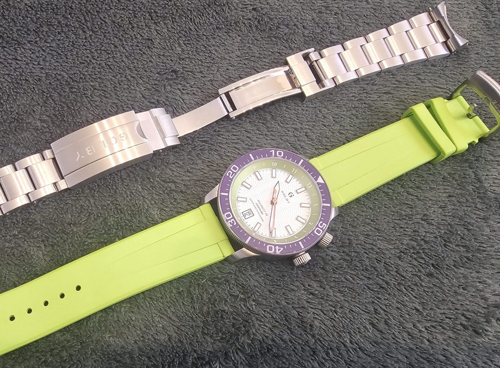
The bracelet gets a lot of things right. The thing to bear in mind is that we’re just getting to know the Montera Estria, which is also a UK watch and one that has a lot of positives but also one real negative: the bracelet is absolute horseshit, and it’s interesting to compare and contrast with the Aquareef’s one. This is because, while Golby’s is far better, they do share some key characteristics.
Firstly, they both use what appears to be the exact same deployant clasp. The mechanism is fine, if a tiny bit fiddly to operate, as it has a two-step process to release it. The issue on both though is that the clasps are massive. It’s just a centimetre too long for our liking. Also, the edges of the bracelets aren’t chamfered on either watch, although the Golby is slightly softer than the Montera, which is very sharp and a little uncomfortable. Thankfully, unlike the Montera, you do get quick-release and on-the-fly microadjusting, which makes a huge difference. Especially as the microadjust has quite a lot of travel, saving us the trouble of having to take out a link to get it to fit.
The bracelet is fine and is a good option if you’re trying to tone down the watch, especially as it sports a full-brushed polish, which helps to drab everything down a bit, but the real fun is in the strap, which is a bold lime green that complements the inner bezel and also happens to be effortlessly comfortable. To us, it’s part of the watch’s true identity. Sure, you can put it on the bracelet, fire up Microsoft Excel and get that report on your boss’s desk by the close of play, but when you put the watch on the strap, it rocks the party. It rocks the house. It rocks the whole world: north, east and south. In the west, seventeen horns blowing. Somebody holla if you want to party.
More so than any other watch in the collection, the Joker was the one that, during the day, I’d notice it and just smile. You can’t help it. The bold, punky green strap and all that lovely dial detail. It comes together in a way that no other watch does. It’s exciting. Like, actually exciting. Watches can be cool; they can be impressive. They can be many things but this is a watch that feels a little rebellious. Shove your report up your arse, boss. I’m going to skate to the beach. And I’ll look better getting there.
If the Stepping Stone lives up to the Coastal and this new Aquareef, I’m calling it. Golby will be the most exciting UK microbrand out there. And you can see that they’re learning and changing with every release. The Coastal taught them to be bold with colour, the Aquareef 40 taught them to mix design with high specification and as Craig himself told us “we have day jobs, so we’re creating watches that we genuinely love rather than chasing margins and sales. That gives us the freedom to be creative and push boundaries.”
He goes on to say he knows that their designs might not be for everyone but when you’re putting out watches of this quality, and with drop dead looks to boot, they actually might be.
4.5 out of 5.0 stars
Pros:
+ Excellent design
+ Good quality movement
+ Comes with a choice of strap or bracelet
+ A genuine improvement over the original
+ Rotating inner bezel is a good bit of functionality
Cons:
– Might irk anyone who bought the original
Summary:
This isn’t the original Aquareef in a slightly smaller size. It’s a complete upgrade, improved in numerous different ways. And in this colour (get the word ‘way’ out of your head, you’re not American. Unless you are. But still.), the Aquareef 40 is as bold, playful and just entirely joyous. It’s one of the best watches of 2025 and a credit to the UK watchmaking scene.
JUST THE FACTS
Availability/Options: This watch comes in several colours of which I think most of them are still in stock (apart from the British Watchmakers’ Day 2026 Limited Edition). However, each is limited to just 38 and when they’re gone, they’re gone.
Brand: Golby
Model: Aquareef 40
Style: Diver
Case Size: 40mm (47mm lug-to-lug)
Movement: Miyota 9150
Material: 316L Stainless Steel
Lug Width: 20mm
Band Type: Silicon strap/Steel Bracelet
Price: £400 ($540)
2 thoughts on “Watch Review – Golby Aquareef 40”