
Like a puppet on a strap.
That tricky third outing. Be it an album, a movie sequel or even a computer game, history is littered with terrible thirds. The first one is where all the energy and good ideas are. The second is the refinement. But the third is usually some sort of over-produced nonsense that strays too far from the magic of what came before. The third Wu-Tang album, the third Godfather film, Driv3r. I’m told that Coldplay’s third album wasn’t any good either, but surely the first two were bollocks as well?
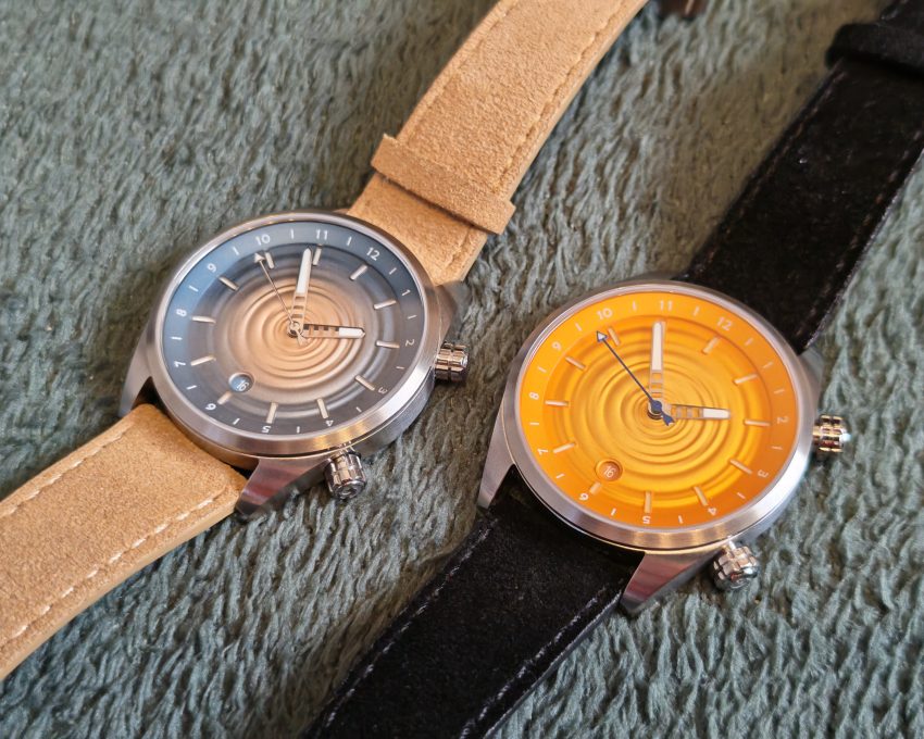
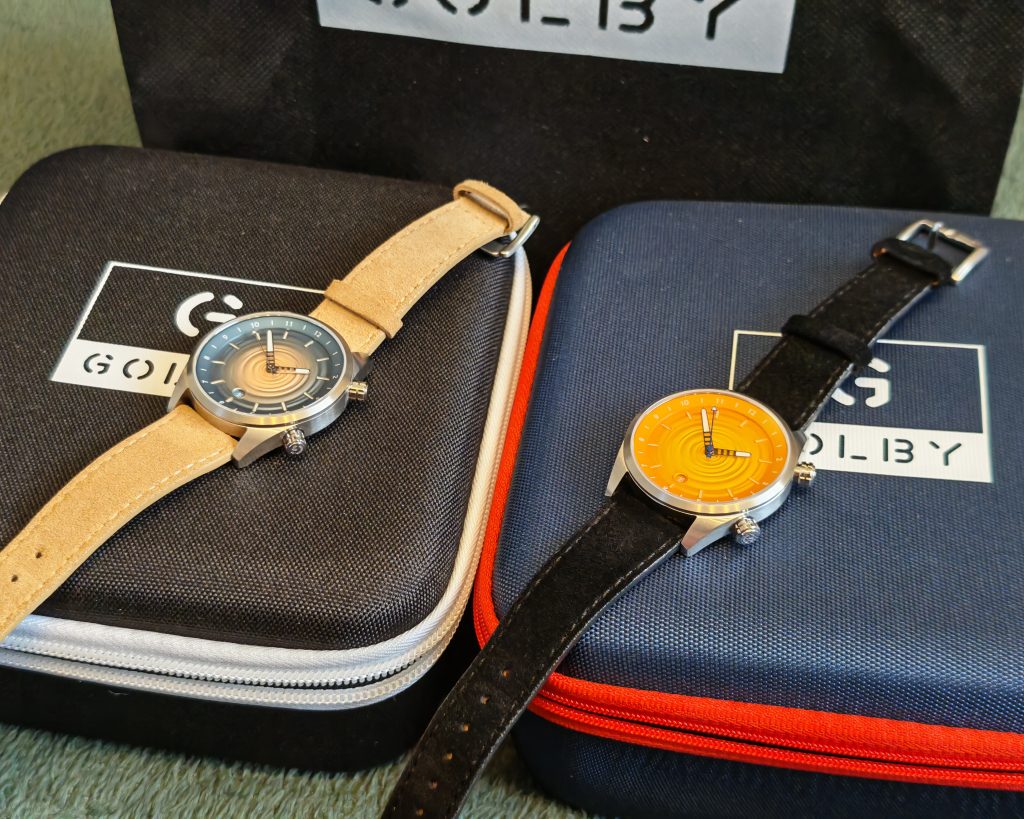
But anyway, here we are taking a look at the Skipping Stone, the third release from husband-and-wife team Sarah and Craig Golby. Can they follow up on the brilliant Coastal and the iconic Aquareef? Or will this be their Superman III (‘evil Superman flicking peanuts at bottles’ scene aside)? Thankfully, Golby has sent us the Sunset (orange) and Sandy Shore (blue/beige) versions on loan to check out (although, please note, these are prototypes).

This Solihull-based brand has made a name for itself thanks to its characterful designs, based on the Cornish coast, a favourite family holiday destination. Does that mean if I make a watch, I have to base it on Pontins in Camber Sands? Eesh! I met the TV presenter Leslie Crowther there though. He asked if Mum was Russian (she’s Ukrainian). She really didn’t like that. There’s a reason why he’s not been eligible for Celebrity Traitors since (on account of being dead. Just saying).
I reviewed their first watch, the Coastal, a year ago, and it’s been one of my top three watches ever since. In a collection of over a dozen or so pieces, its position is locked down. Watches come and go, but I can’t imagine a time when it won’t be there alongside my favourite Citizen.
What struck me about the Coastal was the details. The rippling dial, the lighthouse-shaped hands and indices, and the finishing. I kept spotting things about it during the review process, and by the end, I was completely smitten.
I followed up with the Aquareef 40 (technically their third watch, but really it was just a refinement of their first). The iconic ‘Joker’ colour variant (not way, I’m not American) just seemed like something I couldn’t miss out on. And while it works with Golby’s own white FKM and purple NATO straps, it’s just undeniable on the green FKM. Sure, it’s more of a showy Summer watch. But given that’s a season that lasts about 45 minutes here in the UK, it doesn’t get quite as much wear as it should. I still love it though.
Both those watches shared some key DNA, though. The colour-first design, the oil-pressed dial textures and, of course, the impressive detailing. Golby have been creating their own identity, and so I was keen to see how that extended to the Skipping Stone.
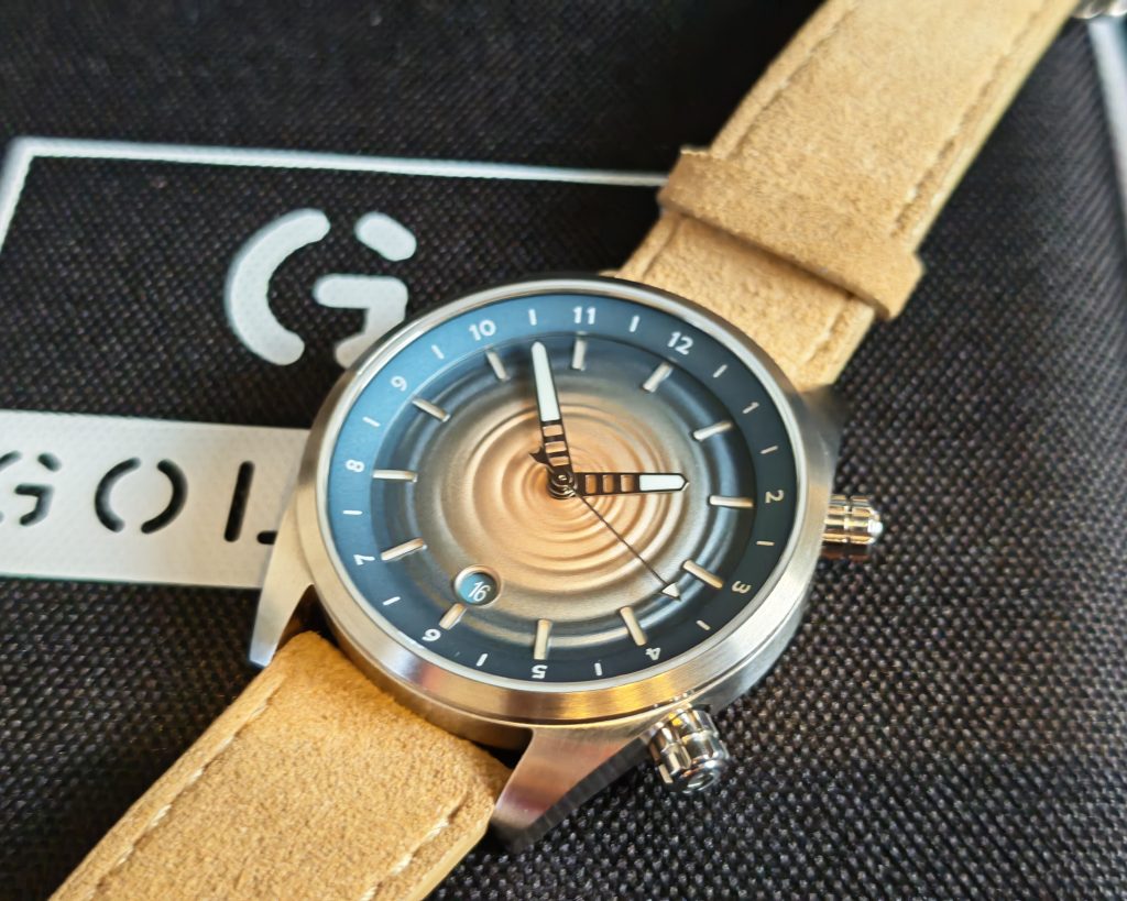
Inspired by another family trip to Cornwall where the family were skimming stones across the water, this watch changes up the wavy Seamaster-ish dial for a concentric circle ripple effect. That’s where the watch design lives up to the name.
This dial texture first appeared on a (very) limited edition version of the Aquareef that was made for British Watchmaker’s Day, and I didn’t really look twice at that one (because it kind of looked like an infected pimple) but in the more refined context of this watch, it looks great.
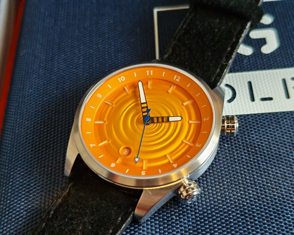
These aren’t just circles. There’s more of an irregular, spiral-like effect, oil-pressed into the dial, to it that speaks more to the original idea of ripples in water. It’s something you need to take in over a few minutes to really get, and it’s such a nice effect. If they’d pressed in regular circles, it might have looked good, but it wouldn’t look as organic and flowing, and flow is everything when it comes to this watch, as we’ll explore during the review.
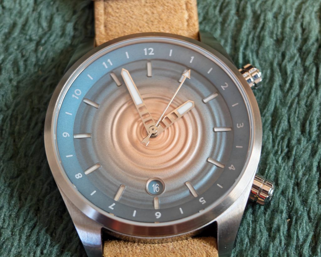
And while it would have been easy to stick to the tried and tested formula of their previous watches, Golby have continued to evolve on this watch. That’s evident with the indices, which aren’t applied this time but instead are cut out of the dial with a lumed surface below. These cutouts are clean with a slightly raised edge and perfectly aligned.
One notable aspect of the dial is the lack of text. No brand name, no pointless water resistance rating. Most dial text is a waste of dial real estate (like, do you really need to be told every time that your watch has an automatic movement?) and so really nothing is lost here. It’d be nice to have the Golby name or logo on there maybe, but giving full prominence to the dial texture feels like a good thing here. Speaking to Craig, this decision was all about not interrupting the ripples, keeping the flow.
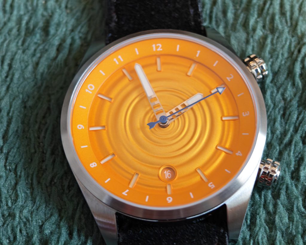
There is also a colour-matched circular date window at six o’clock. Again, the colour choice was all about not interrupting that flow while keeping the usefulness of the complication. The date windows were well-aligned on both models that I tested. That’s been an issue on quite a few watches that I’ve seen recently, so much so that I’m beginning to rethink my stance on date complications (I normally love them, but if a brand can’t get it right, it should be left off of the dial).
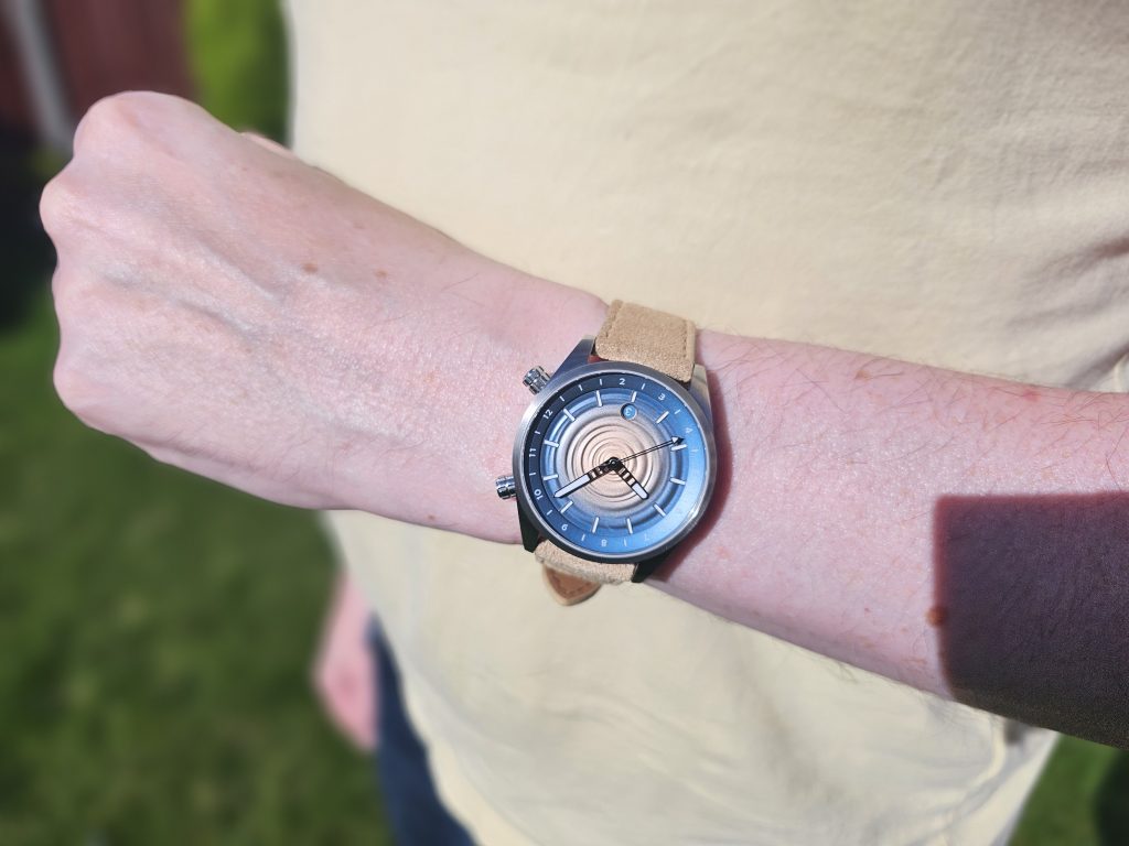
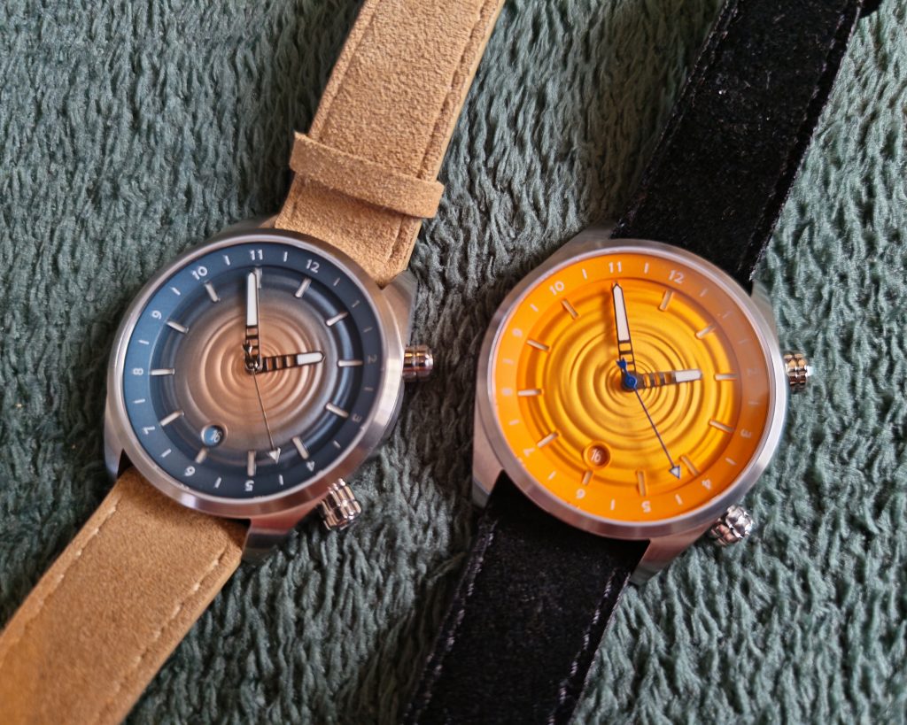
And let’s talk about colour. The Sandy Shore grabbed most of the attention with buyers thanks to its clever sandy island colour scheme, and you can see why it’s so popular. It speaks so directly to the brand’s coastal inspiration. Even if I do have ‘Like A Puppet On A String’ stuck in my head every time I look at it.
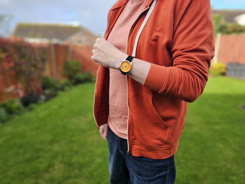
The orange ‘Sunset’ variant is more dynamic in life than I was expecting. My initial thoughts when this range was released were that the colours were maybe a little too soft and, er, dessert-y. After the smack-you-in-the-retinas bold hot pink/purple of my coastal, these watches seemed a little less dramatic, but actually the orange is particularly bold here. Not saturated and punchy like a Hisense TV calibrated to be in a branch of Currys but bright and cheerful.
Of course, this week sees the release of the Autumn/Winter collection, which adds some darker hues to the range. But what’s really exciting is that of the eight watches available (nine if you include their collaboration with artist Gary Farr), only one of them isn’t boldly coloured (the ‘Dark Night’ variant comes in a dramatic, almost gunmetal grey). Golby are clearly leaning into their big colour era, and I’m here for it.
The hand set leans into the same lighthouse-inspired aesthetic as the Coastal range, albeit with slightly larger hour and minute hands (they’re in similar proportions, but the dial is larger so the hands have to be longer, and therefore wider, to fit). The seconds hand is more noticeably different, being dark blue and with an arrow-like point and a nock-shaped counterweight at the bottom. Yes, I Googled the word ‘nock’, I’m not Robin Hood, man. It turns out that the shape is based on the weathervane on top of the Mevagissey Lighthouse in Cornwall. Detailed touches like that are why Golby are so highly regarded.
As you’d expect from Golby, the lume performance is excellent. You’ve got BGW9 Super-Luminova under the dial (visible through the cut-out indices) and squeezed onto all three hands. It’s not quite as dramatic as the Coastal, but that’s an absolute lume king. That said, it’s very functional, long-lasting and legible.
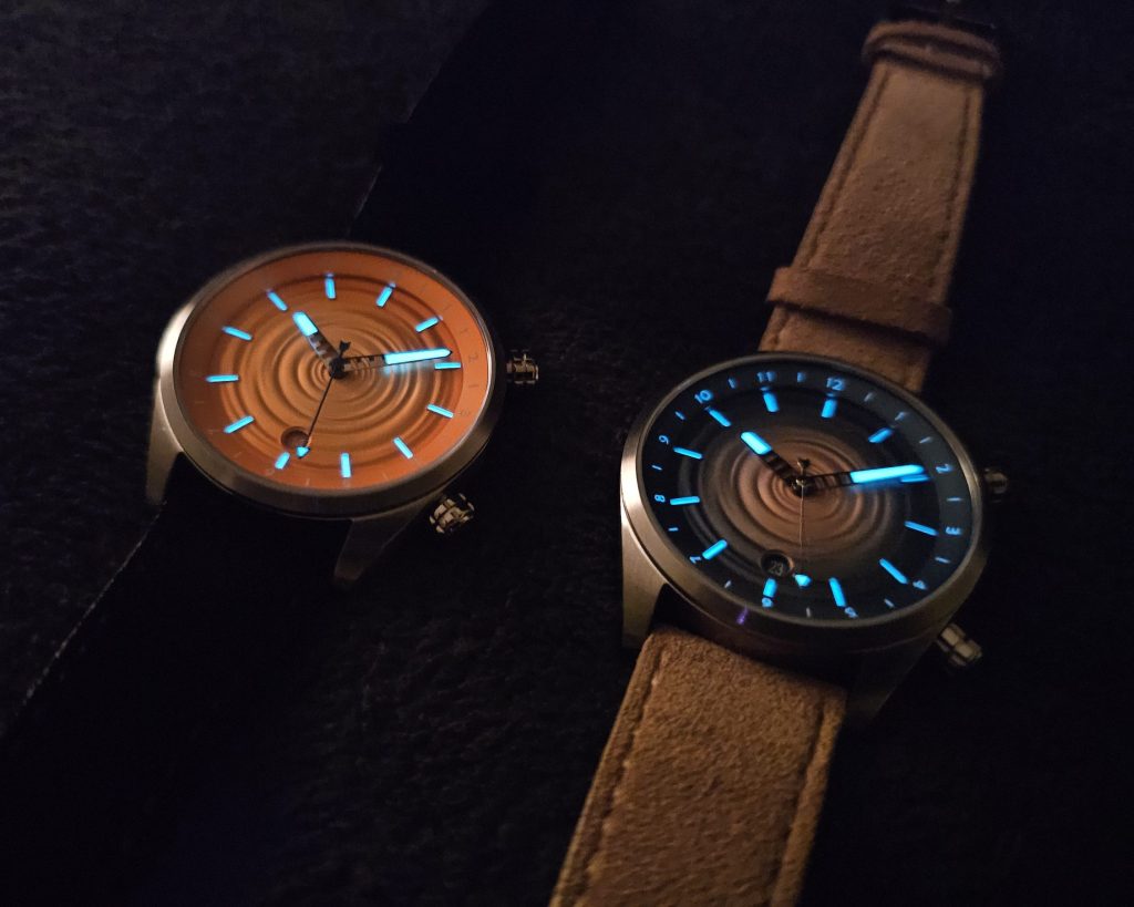
One thing that Golby watches all seem to share is a matte-polished rehaut, and that’s the case here. It’s colour-matched with a cool, metallic finish and the numbers one through twelve printed as hour markers. However, there’s actually some dual timezone tracking functionality, as this whole inner bezel actually rotates, allowing you to track the time somewhere else in the world without having to subject yourself to the disgusting indignity of a fourth hand on the dial (spit!). Ironically, I barely care what the time is here, let alone in Riyadh or some shit like that, so I’ll continue never buying a GMT. This, however, is pretty cool. The Aquareef did the same thing. I do prefer the usefulness of the Coastal’s countdown bezel, though.
Speaking of bezels, the Skipping Stone’s one is thin and classy. It’s small and toned down thanks to a nice linear brushing that sweeps all the way around it, and it slopes down to the mid-case, which sports the same brushing. If I’m being picky, I’d maybe have liked some contrast, but you get the impression that the case’s job here is to give full prominence to the dial and add a coastal ruggedness (full polish casing is very prone to scratching). That’s certainly backed up by the watch’s demure dimensions. At just 39mm wide, 10.5m thick and with a snug lug-to-lug of just 45mm, this is certainly a very wearable watch.
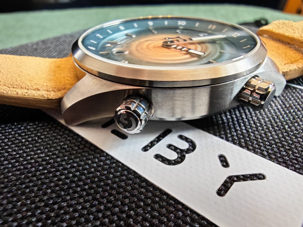
Don’t mistake that for being soft and dainty though, as the 316L stainless steel is hardened to a VH (Vickers Hardness, my nightclub name) rating of 1000, which means it’s over four times harder than the untreated stuff. It may not stop a field point or broadhead arrow (don’t get distracted by your research, me), but it’s tough stuff and means this neat little dress/GADA can take a bit of punishment.
That’s also true of the crystal as it’s a flat sapphire. These things are never infallible, but it might just go one or two rounds against your nearest bastard doorframe before relenting. There are also five layers of AR (anti-reflective) coating underneath and, yeah, so far reflections haven’t been much of an issue.
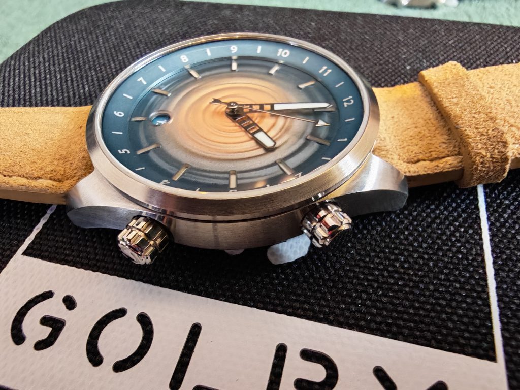
The mid-case also sports two crowns. The top one, at two o’clock, rotates that inner bezel. Thankfully, it screws down so you’ll not be nudging your way into Bulgarian time or whatever.
The four o’clock crown is used for operating the watch itself. It’s your standard three-position screw-down affair, with position zero being used for winding, position one setting the date and position two setting the time.
Both crowns are unguarded, interestingly shaped (you’ll have to check out the photo below) and easy to grab. The bottom crown is signed with Golby’s ‘G’ logo while the top one isn’t. That’s what I was hoping for when I checked it. Not sure why, but signing both would seem like too much. They’re certainly unique (the shape was designed by Sarah Golby and sketched out that way), and they’re large and grippy by design without having the usual coin grip texture.
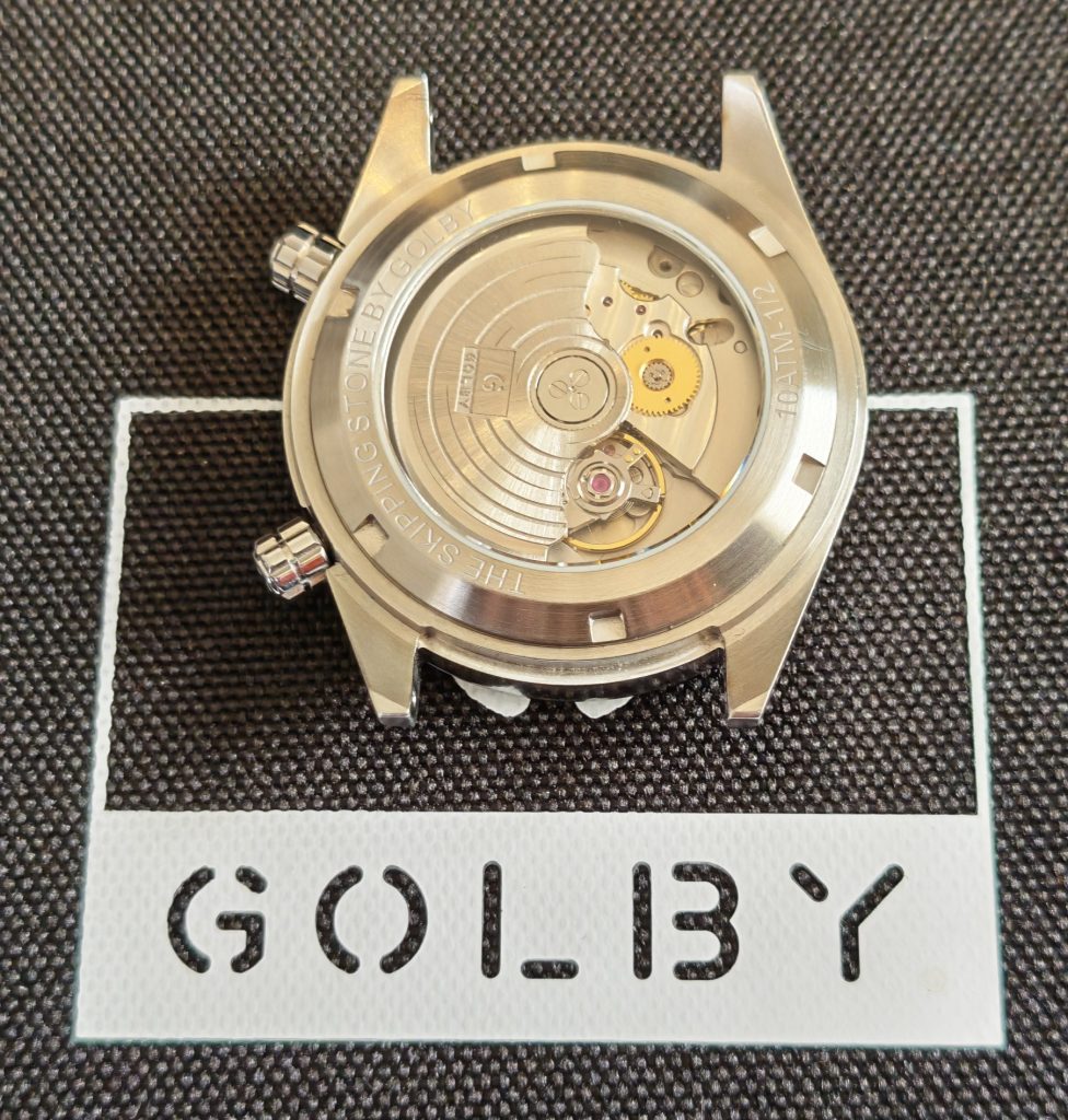
The bottom of the case keeps things quite simple. You get ‘The Skipping Stone By Golby’ engraved at the top and ‘10 ATM’ below, the edition number (these are numbered limited edition batches of just fifty per colour), a reference to the 100 metres of water resistance. This, of course, doesn’t mean you can just flap around down there like Madison the mermaid, but it’ll certainly survive a bit of shallow snorkelling. Just don’t try to spin the watch off of the surface of your nearest lake.
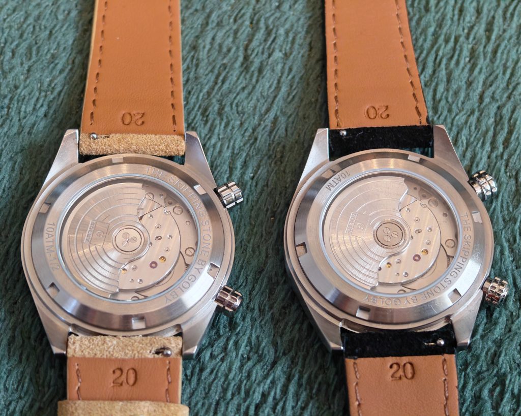
There’s also a nice exhibition window back there which gives you a look at the Miyota 9015 movement that powers the watch. The 9000 series Miyotas are becoming the real standard for good mid-price microbrand watches, and it’s nice seeing Golby continue to use them. You get 42 hours of power reserve (meaning that it’ll power itself up when you’re moving your arm about, thanks to the signed custom rotor). It has hacking seconds, shock protection, decent accuracy (-10/+30) and a 28,000 vibrations per hour sweep that’ll match most Rolex watches.
The movement, specifically the rotor, is surprisingly noisy. I’ve never really cared about rotor noise before but it is quite apparent here. That’s mainly because the Miyotas are pretty noisy generally, but also because of the delicate dance between water resistance and thickness. If the watch was rated for, say, 200 metres, you’d need an extra millimetre on the exhibition window and maybe half that on the crystal. So what you lose in water resistance, you also lose in noise reduction, but what you gain is a lovely slim, wearable profile.
With Golby starting out as a strap company, you’d expect good things in that department, and you won’t be disappointed. Each watch comes with a stainless steel bracelet with the 1000 HV hardening, a brushed finish, on-the-fly micro-adjust, screw pins and curved end links. Basically everything you want from a bracelet.
You also get a suede or leather strap too. The straps are very comfortable and pretty stylish. The sandy beige strap for the Sandy Shore is a perfect match, so much so that I can’t really imagine using the bracelet on that one. The black leather strap on the Sunset (orange) is quite dramatic. Obviously, it contrasts strongly with the dial, but it’s maybe a bit too dark for the otherwise summery vibes of the watch.
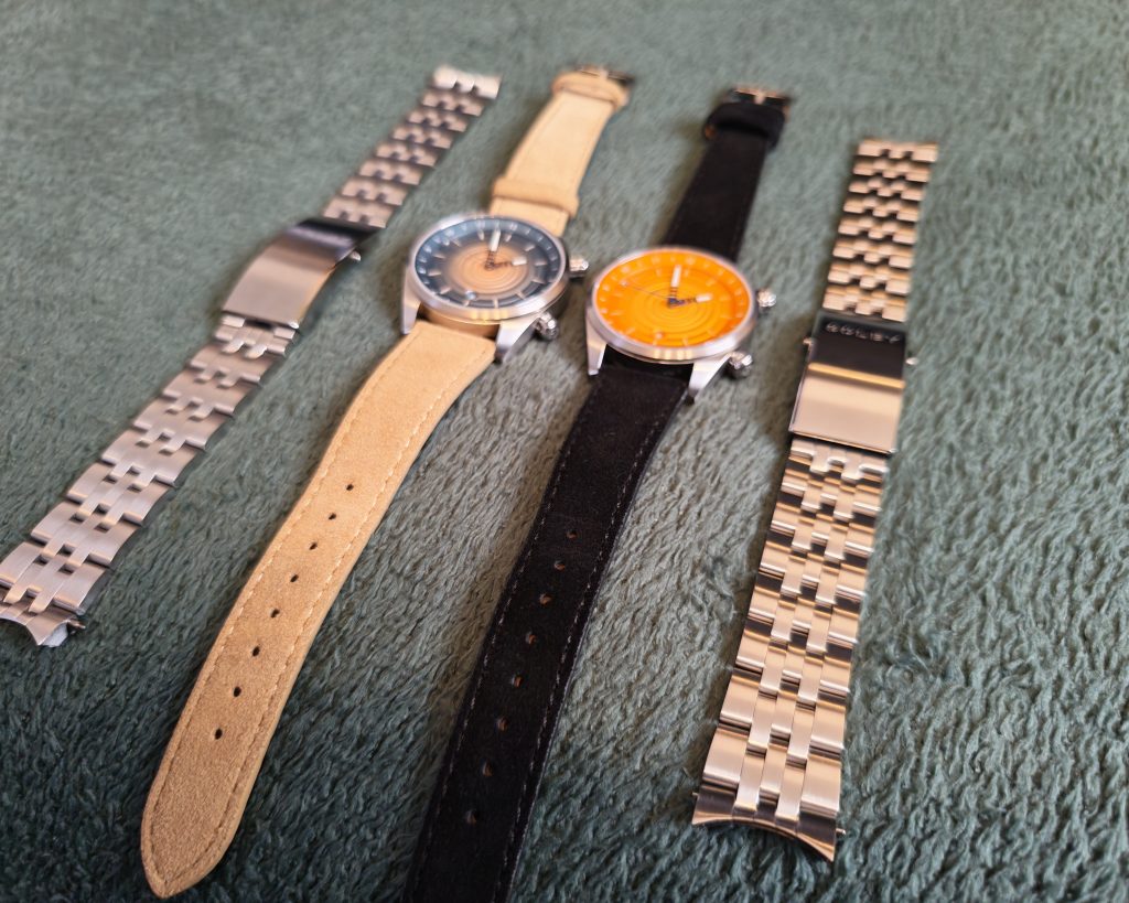
However, what’s great is that Golby don’t mandate these matches. When you order a Skipping Stone, you get to pick from a choice of nine straps (or pick a random one if you can’t decide).
Both the bracelet and the strap have very easy-to-use quick-release spring bars, so switching them out is a total breeze. Literally doable in ten seconds. Plus another ten seconds if you forget which end of the watch the buckle goes on. The only downside is that on the bracelets, the keepers can be surprisingly stubborn, so getting them into place can take a bit longer than you’d like. A minor niggle, but it actually took me longer to shift the keeper into place than it did to switch over the straps. That said, I was wearing the watch at the time and due to the taper of the strap, it’s only an issue when adjusting for a thin wrist.
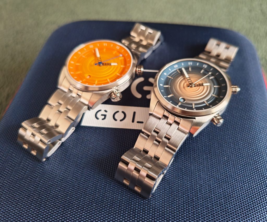
As ever with Golby, there’s a really good mix of standout design and great specs here. From the premium movement, the sapphire crystal, the quick-release bracelet/strap, case materials, and the lume, there are no compromises here. You’re not giving up anything for that design. Well, apart from money, of course. But at £495 (£450 early bird price), you won’t feel ripped off. We’ve reviewed watches with these specs that cost more and don’t look as good.
So, Golby have survived that tricky third release and doesn’t show any signs of slowing down. The Skipping Stone takes everything you love about the brand and pushes it forward while sharing some key design and functionality elements with previous releases.
4.5 out of 5.0 stars
Pros:
+ Original design
+ No compromises on spec
+ Effective lume
+ Good bracelet and choice of strap
+ Innovative while staying true to the brand’s established design language
+ Very wearable dimensions
Cons:
– One of the noisier rotors we’ve tested
– Colour-matched date wheels can be a little tricky to read
Summary:
Another Golby, another iconic look. They continue to go big on colour and design but there’s a humbleness to it. This doesn’t feel like something designed in a high-end boutique watch studio in a major city. It feels like a family business pushing the limits of design while keeping it relatable and honest. Add to that all the specs you want to see at this price, and you’ve got a watch that’s easy to recommend.
JUST THE FACTS
Availability/Options: The Skipping Stone now has eight main variants, along with one special edition collaboration version. Each one is limited to fifty pieces. Currently none are out of stock apart from the Sandy Shore version.
Brand: Golby
Model: Skipping Stone
Style: Dress/GADA
Case Size: 39mm
Movement: Miyota 9015
Material: 316 Stainless Steel (hardened)
Lug Width: 20mm
Band Type: Bracelet and leather/suede strap
Price: £495