
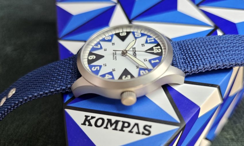
All these things shall Kom to Pas.
One of the really interesting aspects of the microbrand scene is how some of these brands just seem to spring up from friends or partners deciding they want to make a watch. Whether it’s the husband-and-wife team at Golby, the weaponised toddlers at Montera and BVOR, or just a couple of pals deciding to have a go.
It doesn’t matter if you’re Christopher Ward or a debut brand; it’s impressive that anyone ever manages to get a watch to market. It’s easy to underestimate the sheer amount of work it takes: from market research, design, sourcing the components, getting the watch made and then the infinite pain of marketing them and trying to find an audience, let alone buyers.
And what’s really cool is when a microbrand finds an identity, a design language that is uniquely their own. From McQuaide’s Damascus Steel cases to Mezei’s fluted dials, we’re always happy to see a watch that isn’t just trying to be a sort-of-Seamaster or a squint-ever-so-slightly Speedy.
One such watch is from UK upstarts, KOMPAS (I’m not shouting, that’s how they stylise their name). Started by friends Aslan and Giovanni, two men with very different skill sets, back in 2024. Friends for over ten years, Aslan was the ‘watch guy’ of the partnership, having previously worked in the luxury watch industry as well as operating his own luxury watch consultancy. He was the industry insider with the marketing chops, but he needed to bring in Giovanni, an experienced architect with an eye for award-winning design. And right from the start, they knew they wanted their first watch to be a statement piece. It had to be unique but also functional, something built for adventure.
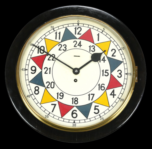
Inspiration struck one evening at a pub when Giovanni saw an old RAF Sector Clock. This historical clock was used to keep track of enemy aircraft during the Battle of Britain thanks to the coloured five-minute markers on its face. Split into three colours, the clock allowed ground-controlled interception staff to keep track of enemy plane formations back when radar wasn’t quite up to the job, while also providing as much readability as possible. It’s a hell of a story, but it’s one that we don’t have to tell in German thanks to this ingenious clock and the people who came up with the concept.
It was Giovanni’s job to take such an iconic and important design and modernise it into something more suited to a modern audience, and after almost two years of design, reiteration and prototyping, KOMPAS finally released this series (it’s not actually got a series name) in December 2025.
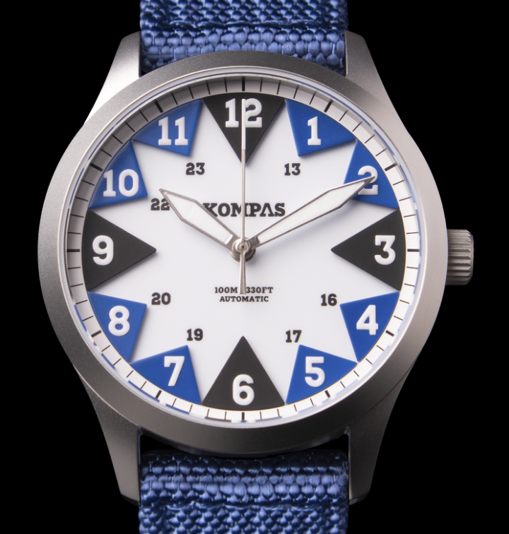
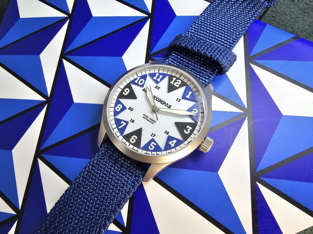
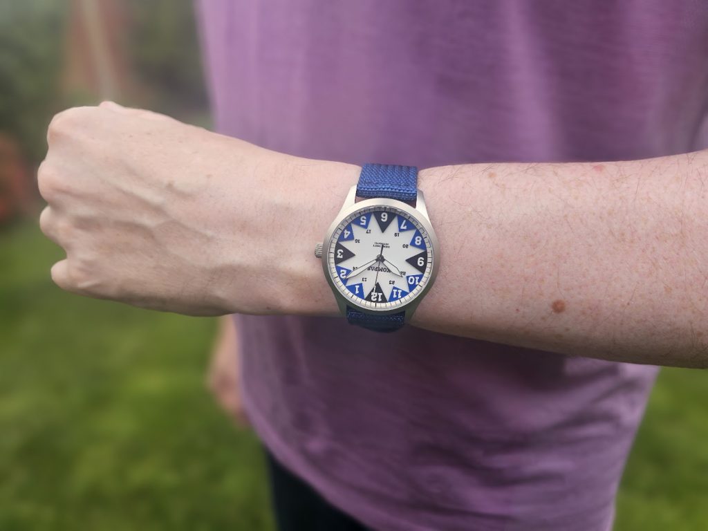
The DNA of the original Sector clock was there, but the three-colour palette was now adapted for each of the four colour variants of the series, with each watch having two shades of its particular colour and black at the 3, 6, 9 and 12 positions, each one inspired by adventure. a The North in mountain greys, the East in forest greens, West in dramatic reds to reflect vibrant modern culture and, the watch we’re looking at today, the South which gets its colours from southern seas.
Knowing the history of the Sector Clock genuinely increases the likeability of the watch. Without the backstory, the watch could just seem quirky for the sake of it. A look that might be hit-or-miss depending on your own personal taste. Indeed, when I first saw it I wasn’t sure. It’s so unusual that my brain had a job trying to decide how I felt about it.
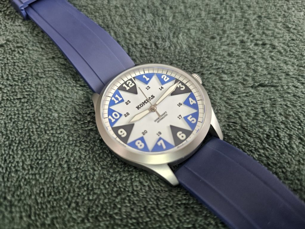
It all comes down to those triangular mounts for the indices. The sections that were coloured on the original clock, and are the reason the local Tesco meal deal isn’t a Sauerkraut sandwich washed down with a carton of Glühwein, are the defining feature of the watch. Without the story, they could look like bunting at a street party, but with the historical knowledge, they become something far more iconic. Just get used to trying to explain ground-controlled interception to people because I’ve read about it and watched a couple of videos, and my explanation four paragraphs back was like me trying to explain a dream an hour after waking up. And I’ve proofread that three times now.
The brass dial is coated in white enamel and sports the company logo in the top half and ‘100M | 330FT’ and ‘AUTOMATIC’ in a thankfully tiny font in the lower half. This level of the dial also sports 24-hour numbering on all but the 12, 3, 6 and 9 positions. A throwback to the original Sector Clock.
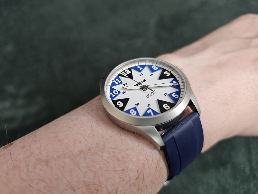
Then you get the indices on those raised triangles. Also made of brass, these triangles add a millimetre or so of height, giving some dimensionality to the look of the watch. Unlike the other watches in the series, the colour choices here are a bit more limited as there aren’t two shades of blue (or if there are, they is only the most subtle difference between them). Personally, I prefer this look. The multiple shades tie in better with the original Sector Clock design, but having just one colour for the blue triangles here tones down the look a bit. The geometry of the sectors is already so striking as it is, calming it with a little less colour feels like a good choice.
Sitting on those sectors are the Arabic indices. Chunky, block-lumed numbers that leave you in no doubt as to what the time is. They’re large enough to stand out against the triangles, and that’s good because they stop them from dominating. There’s really something to this design. The things that need to stand out do, but in a way that never feels like the elements are competing.
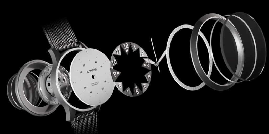
One feature that I really like is the chapter ring. It’s just the cleanest, most legible one I’ve seen on a review watch. Sixty clear white sections separated by thin black lines with slightly bolder lines every five minutes. It’s very much in keeping with the whole instant legibility concept of the original clock. In real terms, it makes setting the watch easier than it is on other watches in my collection. It’s not trying to colour-match anything. It’s just straight-up readability, a concept baked right into every part of the dial.
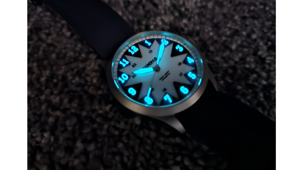
The hand set is also very legibility-forward. Bold sword-shaped hands are used for the hour and minutes, each full of lume and edged in steel, while a stick marker shows the seconds, although it is tipped with lume for extra visibility. Indeed, the lume performance here is absolutely excellent with immediate, bold visibility thanks to the Swiss Super-LumiNova of the indices and on the hands.
This all sits under a sapphire crystal with anti-reflective coating. It’s exceptionally flat and sits a fraction of a millimetre above the case. I’ve certainly not struggled with reflections at all on this one. It all just works to enhance the legibility of the watch.
This is further enforced by the rehaut, which, unusually, leans inward. Every other watch we’ve reviewed has this part of the inner bezel either slope up to the bezel or stand perfectly perpendicular. Here the slight inward lean just draws the eye to the dial. No distractions, no unnecessary detail.
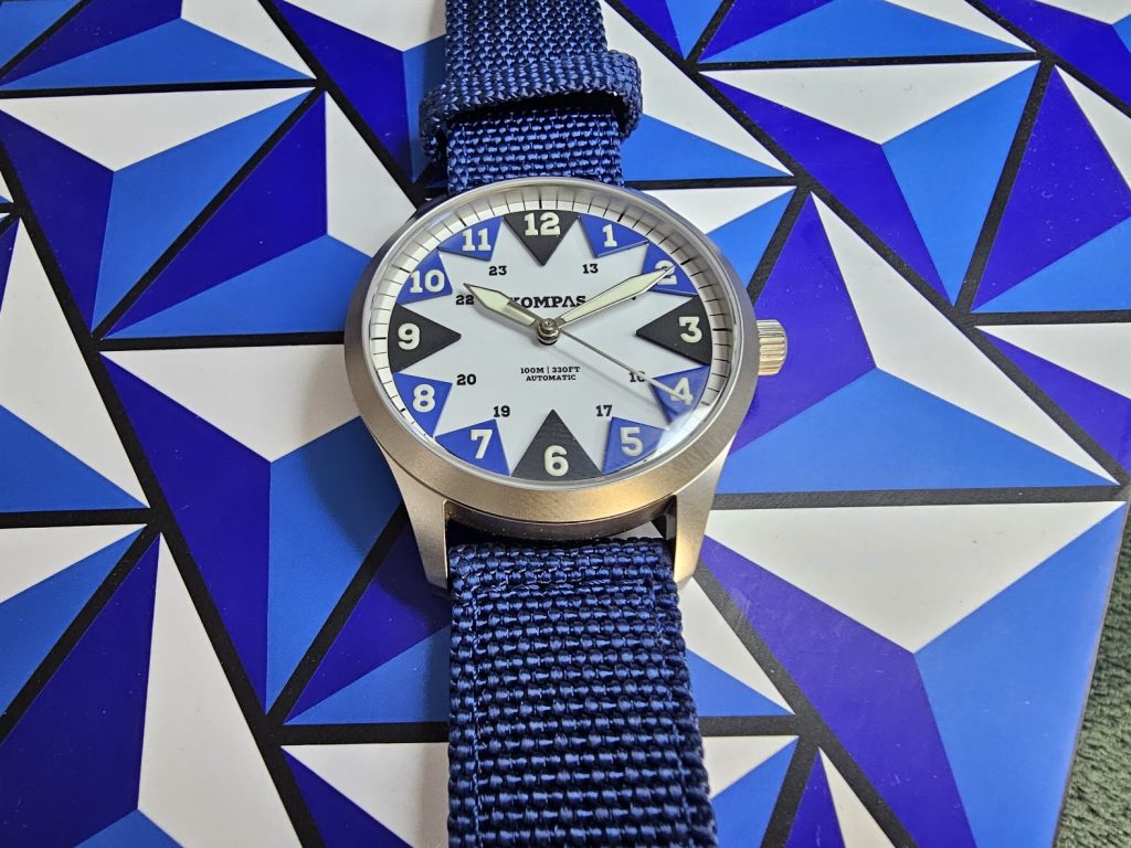
Indeed, the case supports the dial perfectly thanks to its sandblasted finish, reducing glare and giving the stainless steel a bit of built-in protection, as it’ll hide scuffs and scrapes far better than a full-polish finish. This was designed to be rugged. It also looks more premium than full-polish too.
The bezel is slim and immediately sinks down into the case, all with that same finish. The proportions are particularly tidy too. 39mm across, 46.5mm lug-to-lug and just 10.4mm thick. This makes for an excellent balance between the showiness of the dial and the understated case. The case is designed to wear comfortably, with the curved lugs dropping down to hug your wrist while the cushioned bottom allows you to wear the watch all day and night, without it ever feeling awkward.
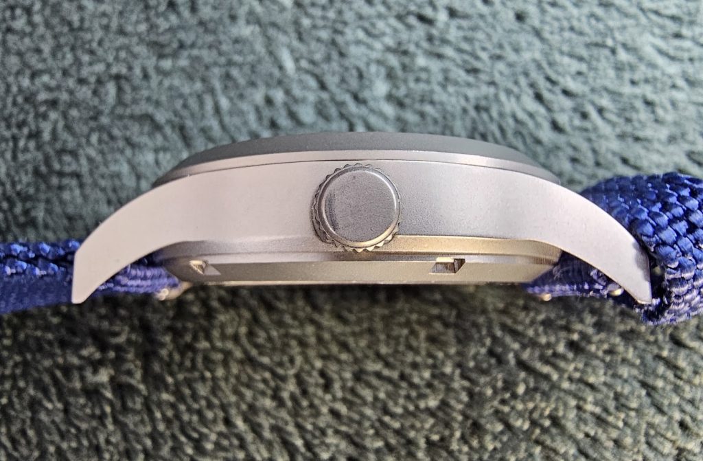
A screw-down crown sits at the 3 o’clock position. It’s unsigned but otherwise feels nice and grippy. It’s a tiny bit larger than some others, but that just feels nice and functional to me. I appreciate the lack of crown guards too. This is a watch that doesn’t get in your way.
Operating a no-date Miyota 9039, the crown opens to two positions: winding and time-setting. Being a Miyota 9000 series, you’re all set for precision and reliability as well as the usual hacking seconds, 28,800 vph sweep and 42-hour power reserve. You also get a good look at it thanks to the watch’s exhibition case back. There are no surprises with it in terms of decoration, although the rotor is custom and signed with the KOMPAS logo.
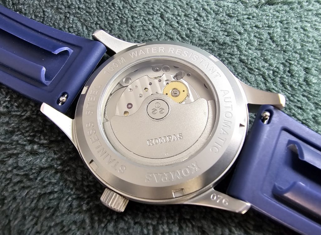
The window is surrounded by some basic information. You get the company logo (nicely curved now to fit the shape of the caseback), ‘STAINLESS STEEL’, ‘100M WATER RESISTANCE’ and ‘AUTOMATIC.’ It’s nothing special to look at, but it does all match the sandblasted finish and tone, so there’s some consistency there.
One thing that designer Giovanni has ensured is a cool unboxing experience. The triangular sectors of the watch are mirrored by the box that the watch comes in. An entirely joyously impractical large blue triangle (other models have boxes colour-coded to them also) with a 3D triangle motif pattern. All the triangles, all the time. Total design whimsy.
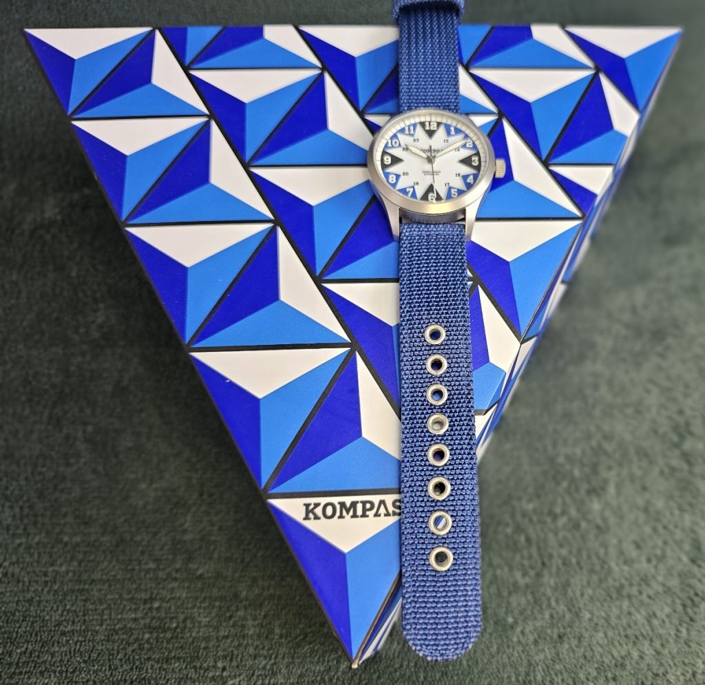
Inside the box you get a satisfyingly heavy warranty card (it might be some sort of metal or just plastic that is denser than the average Chelsea fan) and, excitingly, two straps.
The rubber strap is soft enough to wear comfortably, and while I prefer a darker shade on rubber straps, the only issue is that the colour doesn’t match the blue of the watch. It’s not a big issue, but it might have been nicer if one of the triangle colours had picked up this particular hue. It still looks pretty good, but it’s a little bit of a drab look, maybe a tad too drab.
The other option is the nylon strap, and this is a much better match with a richer shade of blue. It looks great, and the quality of the strap is very apparent, with a chunky double layer. It’s nice and thick, very sturdy and adds to the rugged look and feel of the South. The only issue being that it can be a bit tricky to release it from your wrist as the tang can feel tight in the adjustment holes. It’s not a huge problem though and gets easier when you get the knack for it.
Whatever option you prefer, switching them out is nice and easy as both straps come with quick-release spring bars, making strap changes as easy as falling asleep at a Coldplay gig. And both straps come with sandblasted buckles, each signed with the KOMPAS logo.
I know it’s an absolute cliché to say ‘this watch really surprised me,’ but it very much did. I was initially unsure. The triangles made me think it was time to bake some cupcakes for the village fete, and the name Kompas initially made me think the watch might be Russian (spit!). But when you factor in the direct heritage of British military timekeeping, the unique dial, the brilliantly understated case and the solid specs, there is no doubt that KOMPAS have delivered a genuinely interesting watch here with the efficiency and impact of a bouncing bomb at a German dam.
Of course, it might not be for everyone, nothing unique ever is, but now that you know the story, understand the design and are aware of the specifications, the KOMPAS may well be for you. And, yet again, the UK microbrand scene (albeit by way of Italy and Turkey) proves that it has the heritage and quality to compete on the world stage.
4.5 out of 5.0 stars
Pros:
+ Very unique dial
+ Directly inspired by UK military timekeeping
+ Excellent legibility in light and dark conditions
+ Premium movement
+ Sandblasted finish looks good
+ Good proportions
+ Choice of straps
Cons:
– A niche look
– Might seem pricey for a new brand
– Without the history lesson, the concept might not make as much sense
Summary:
The KOMPAS South is a watch where every design decision seems to perfectly suit the overall mission which is to combine unique looks with ultimate functionality and they’ve managed it.
JUST THE FACTS
Availability/Options: The four models in this range are all limited to a total production run of 100 across the whole range. As such, you probably ought to grab one sooner rather than later if you’re keen. Indeed, the red West model is already sold out.
Brand: KOMPAS
Model: South
Style: Field/GADA
Case Size: 39mm (46.5mm lug-to-lug)
Movement: Miyota 9035
Material: 316L Stainless Steel case
Lug Width: 20mm
Band Type: FKM and nylon straps
Price: £535
This watch was sent to us on loan by KOMPAS.