
If there is one thing you learn about watches as a budding collector, beyond movements, heritage, styles and all that, it’s that no one cares what watch you are wearing. “I got lots of compliments about this watch”. Yeah, on a Facebook group about watches maybe. And, guess what? You’d have gotten ten times as many if you were wearing a quirky Casio.
In fact, I’ve done it once. Complimented an owner’s watch. It was after a meeting at work and I said, “nice Omega, man”, and he replied, “Nice to meet you too.” That happened. I think about that moment a lot.
But this is how Alex and Marcelo, two Brazilian watch enthusiasts-turned-microbrand owners, met. They met on a training course ten years ago, and one of them said “That’s a nice watch.” The watch in question was a Junghans Max Bill (stylised as ‘max bill’, but capital letters matter to me, so you can miss me with that anti-grammatical nonsense). A very cool minimalist watch. And from there they became close friends and eventually decided to make their own watch.
Corso, their microbrand, formed out of that friendship. Named after the road one of them lived on, but also meaning ‘course’ (as in the course of time, as opposed to Level 2 Excel Spreadsheets for Intermediates). La Corso Di Tiempo. The Course of Time.
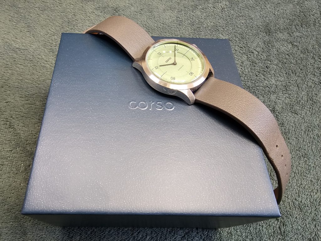
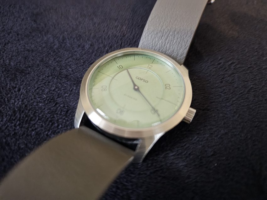
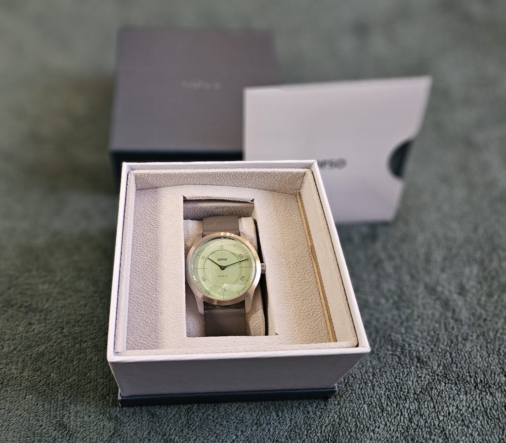
Their first watch was this one, the Clássico. Launched in September 2025, their aim was to put out something with that clean, minimalist design language that led to their first meeting, but with a few caveats. It had to be uniquely theirs, and it had to deliver as much quality as possible while remaining affordable in their home market of Brazil. Quite the challenge.
We were loaned this Clássico by your favourite watch reviewer’s favourite watch reviewer: Fernando from VCT, who is keen to champion his fellow countrymen’s microbrand but, aside from the occasional comment on Instagram, we’ve never spoken directly with Alex and Marcelo (indeed, it was Fernando who told us their backstory).
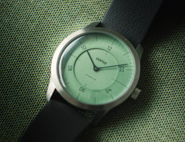
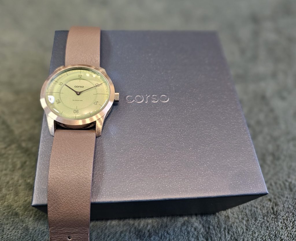
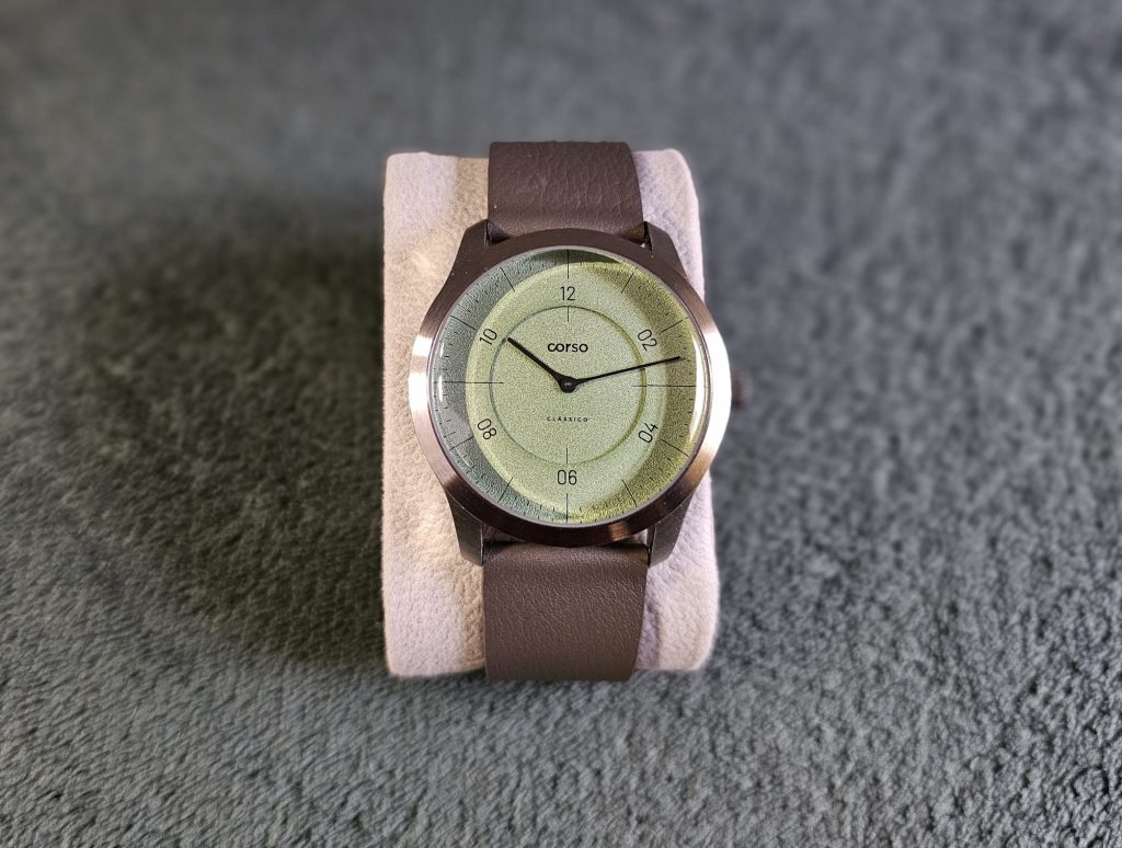
This watch uses quiet design language to make big statements, and that’s evident with the dial. Available (for now, check out the availability section in the specs rundown at the bottom of this review) in seven colours, we were lucky enough to get our hands on the best one: this lovely pistachio green, which, along with the blue, was launched later than the rest (early in 2026). In the range, there are four softer colours (this green, blue, grey and salmon pink) and three dark ones (black, dark blue and dark grey), and it’s crazy how the lightness of the dial completely changes the look and feel of the watch.
The lighter colours create a softer textured look, where as the darker ones look stark and more minimalist. It’s quite remarkable how much of an effect this has. For our money, the lighter ones are cooler and have more identity than the dark versions. And pistachio green is always a welcome colour on a watch, and it really shows off that grain texture finish. For a minimalist watch, the dial alone has a lot of personality.
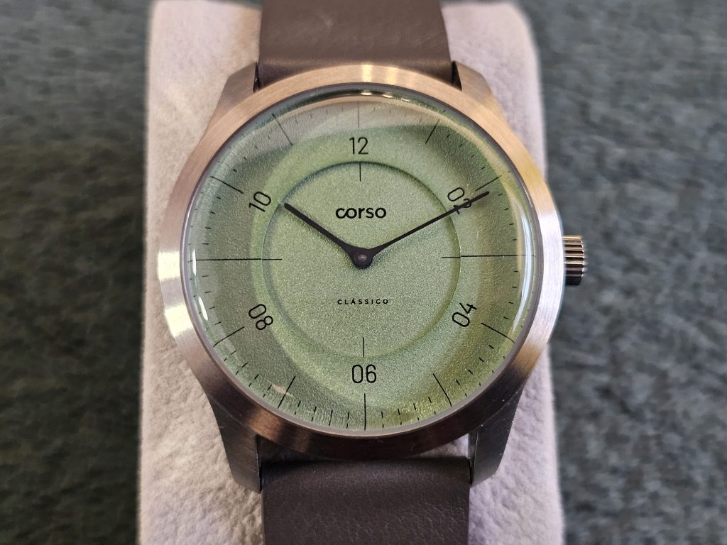
The dial has two layers. The inner section is home to just the brand and model names, printed small enough to not make an impact but legible enough that you know what’s on your wrist. I’m not a huge fan of watches that have zero branding on the dial but, equally, anything more than this much information is too much. Corso has hit the sweet spot. I don’t need to know what the movement is or how deep I can take it into water. Just the facts, ma’am.
The outer layer is home to the sector-style, Art Deco geometry of the indices. You get numbered indices at 12, 2, 4, 6, 8 and 10, but, in what is a very cool touch, they’re all written with two digits (02, 04 etc), which gives them a pleasing symmetry. They also use a similarly slim font to the branding on the inner layer, so everything just has a nice consistency to it.
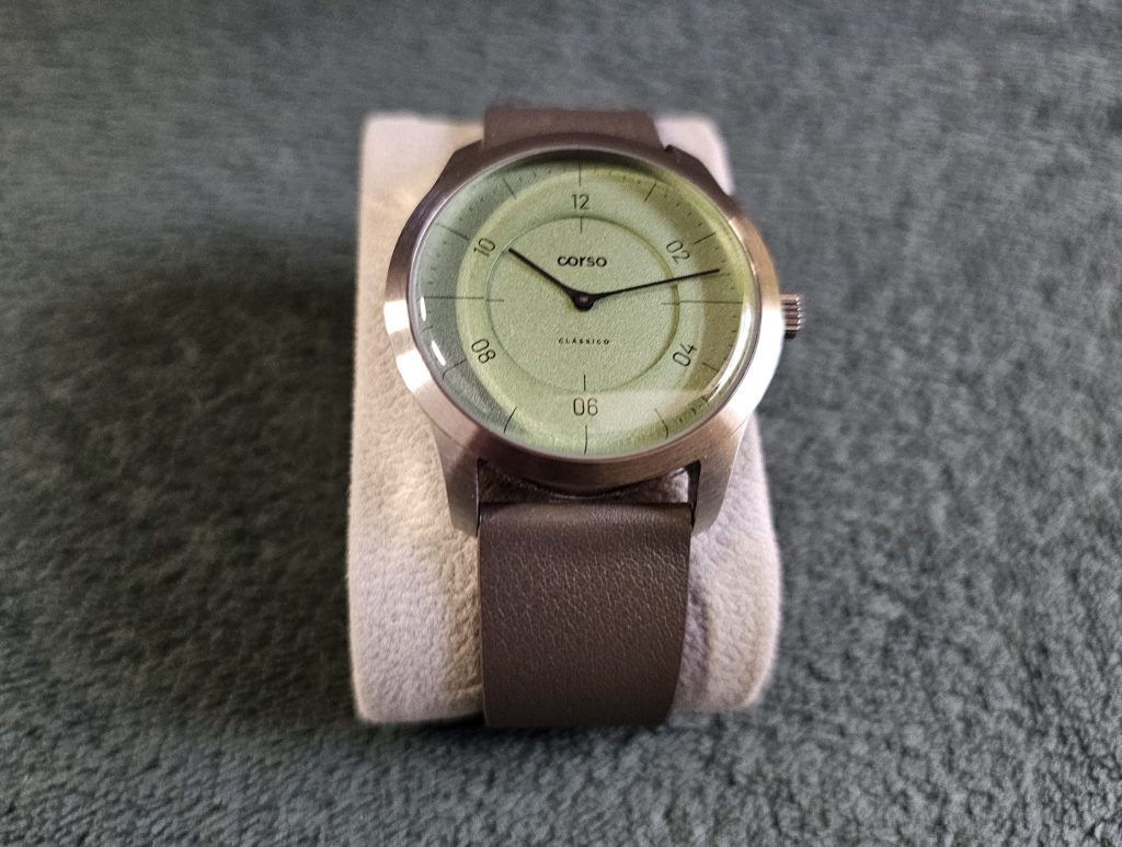
Everything else is marked out with thin lines. Longer markers at the cardinal directions (12, 3, 6 and 9), medium markers on every hour/five minutes and then short ones once each minute. It’s like the reticule of a futuristic laser rifle. It’s all the information you need and nothing else, but also nothing less.
Well, apart from maybe one thing. You see, the watch has a very simple two-hand layout. Just hours and minutes, and that speaks to the minimalist inspirations of Corso. It’s very clean and suits the ethos of the design. And, as a quartz watch, it also has the benefit that you don’t see a tick, just a slow, smooth sweep of the minute hand. Although this can go both ways because you’ll either see it as highly functional. Just the time right there when you look, with no seconds, date or additional text to distract you, or it can look a little bit lifeless.
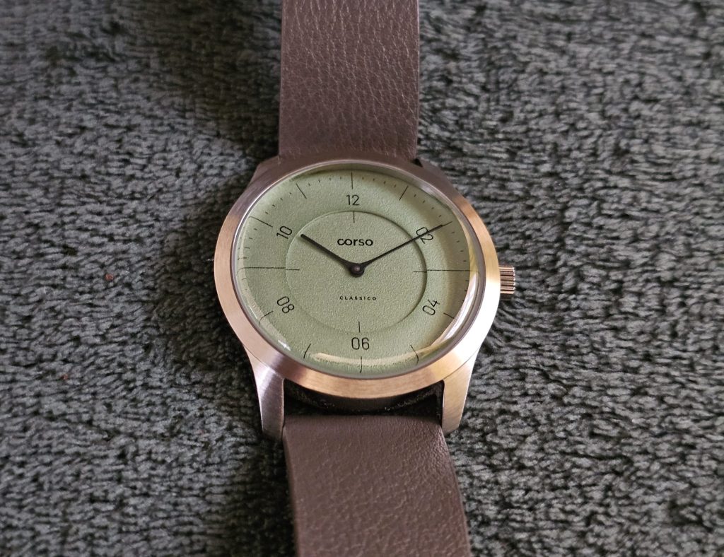
Overall though, I really like the design. In a darker colour, I don’t think I would. It’d maybe be just too plain, but the pistachio green colouring does a lot of heavy lifting when it comes to the appeal of the watch and the thin markings, minimal text and that stepped layer effect all make for a perfectly pleasant look.
It’s certainly got that dress watch appeal and a mid-century character to it. The sectoring and two-hand layout definitely give it a vintage look, especially when combined with the characterful double-domed crystal. Indeed, the crystal is quite a dominant feature, offering quite a curve that gives some nice light distortions despite the interal anti-reflective coating. Thankfully, it’s a sapphire crystal, which it definitely needs to be given that it protrudes above the case.
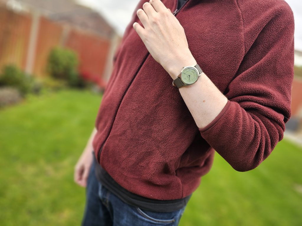
The case does some nice work too. With a diameter of 38mm and a very tidy lug-to-lug of 43mm, this watch is certainly a friend to those of us who have skinny wrists. It looks elegant without being too small. Some additional presence is added due to the thickness, and I’m still not fully decided on how I feel about it.
At 11.5mm, it’s a little thicker than you’d expect, especially given that the movement within is only 2.5mm thick. Admittedly, that domed crystal takes up 2.5mm of that thickness, but you can’t help but feel that this piece could be even more slender than it is.
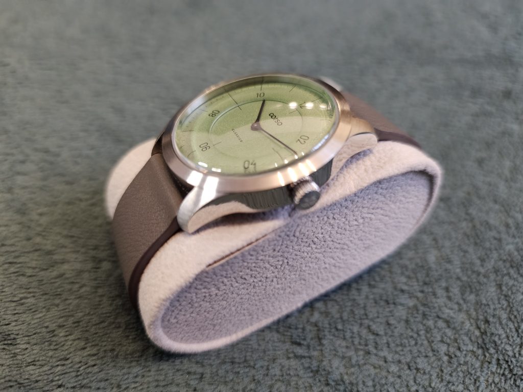
That said, the case is actually rather nice. The bezel sports a very impressive circular polish that continues onto the lugs. It has the effect of toning down the case, giving a bit more prominence to the dial. However, it is contrasted with full polishing on the side and back of the case. That’s the perfect combination. Brushed up front with full polish on the sides. They just work so well together. And I couldn’t see any imperfections in the brushing at all. Very impressive at this price.
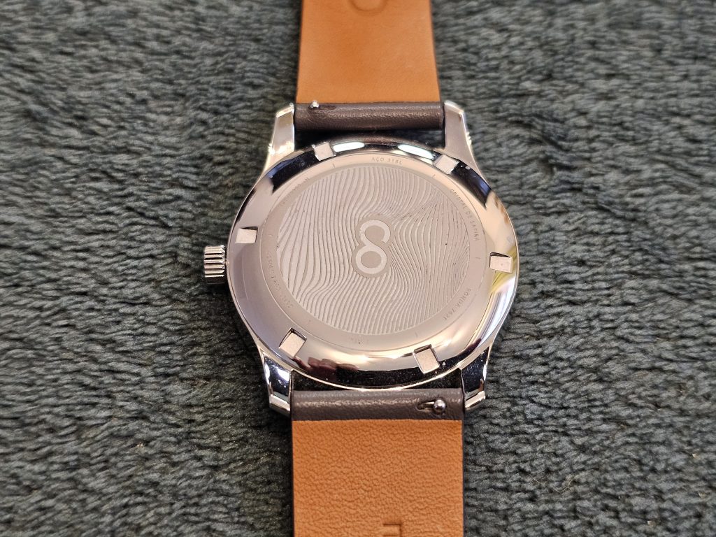
The back of the case is okay but has a few design choices that I maybe wouldn’t have gone with (while acknowledging that the back of watches generally does not matter all that much). In the middle, you’ve got the ‘CO’ from the Corso logo. A slightly odd choice as it’s not the logo they use on the favicon of their website, and it’d probably make more sense to have the full name written there. Again, it doesn’t matter, but is curious.
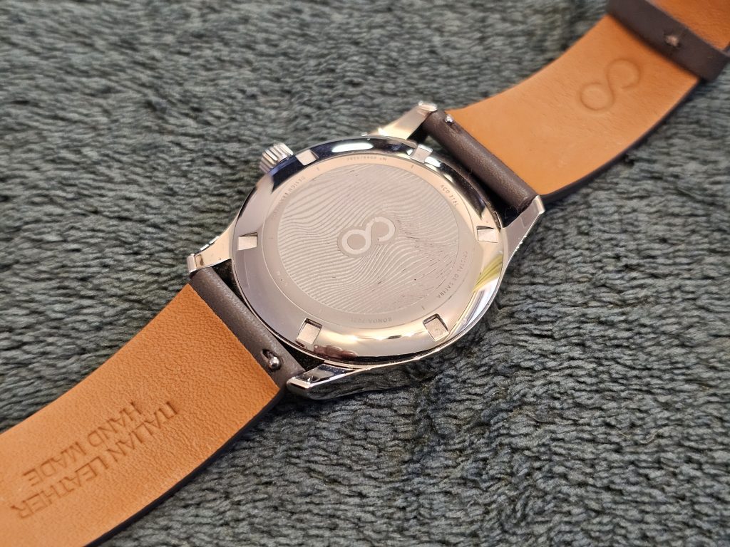
The CO sits in an engraved pattern that seems to be typography-inspired. It doesn’t appear to reference anything specific, but it does add a bit of visual interest and texture. This is surrounded by some engraved spec details about the watch, all written in Portuguese. The only issue is that the font is tiny. Not just small, but really small. Like, get your phone out and zoom the camera in small. Again, it really doesn’t matter, but one of the details is the limited edition reference, which you might want a slightly better view of. But, with all that said, I never look at the back of watches apart from at this moment of the review. I can’t pretend that it matters. Display caseback, art work, whatever. It’s nice when they’re properly on point but I’m not going to give up on a watch because I don’t love the back.
One thing that might bother any OCD-afflicted owners is that the back, when closed, doesn’t align perfectly. It’s like five degrees out from everything sitting nicely (well, more like 95 degrees if you want the logo to sit horizontally). Not a big deal but with everything else, you can safely say that the back of the watch definitely doesn’t live up to the front.
On the side of the watch, you’ve got a 4.5mm crown with coin-edged grip. Visually, it’s the perfect fit for the watch, but it does come with a minor niggle. It’s a push-pull crown with no screw-down, which limits the water resistance a little. It’s rated to 5 ATM/50 meters, which translates to light showering at best. But that’s not the issue.
The small size means that you’ll need to get your fingernails involved when it’s time to set the watch. It’s a tiny bit fiddly but not really a problem also.
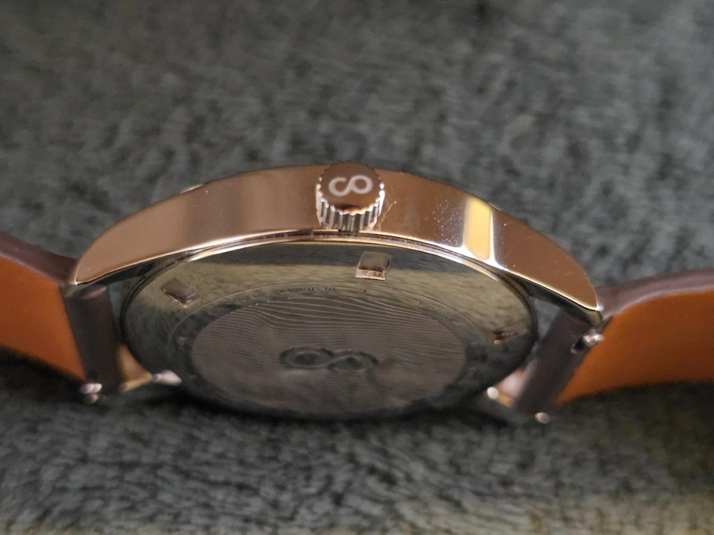
The issue is how responsive the crown is. One turn of the crown zooms you forward an hour easily. Which is good. I like a fast-setting watch. The issue is that because it’s so responsive, it’s actually a little twitchy when you push the crown back in. No matter how careful I am, the action of pushing it in generally pushes the minute hand back enough to put me a minute out. In the end, I found myself setting the watch a minute fast and then hoping the push would leave me at an accurate time.
The movement is a Quartz Ronda Caliber 762e which, as we’ve established, is a quartz two hand module. With no seconds hand or display case back, any automatic movement snobs can safely wear this piece knowing that it’s not going to scream ‘QUARTZ!!!!’ at them. And there are a couple of real benefits to the 762e. Firstly, the battery life is excellent. This will last you ten years. That’s pretty good going. We’re going to have hoverboards by then and will be living on the Moon. Or hunting each other for basic resources while trying to rebuild civilisation. It’s a low-maintenance option that won’t cost you a fortune to replace when you’re trying to find a Timpsons that takes bottle caps as payment while living in a Mad Max style warzone.
It’s also technically a Swiss movement. Well, to be more accurate, it has Swiss parts. It will most likely have been assembled in Thailand but will have been manufactured in Ronda’s headquarters in Lausen, Switzerland.
In terms of accuracy, you’re looking at between -10 to +20 seconds a month. However, because there’s no seconds hand, you’re not really going to be able to tell. So this’ll work just fine as a grab-and-go watch for ages before you have to tease that crown back in place.
One thing that does let the watch down for me personally is the complete lack of lume. As a dress watch, you can make the case for there being no lume on it. It kind of works in that context. Also, the stick hands just aren’t a natural fit for lume, but they do match the indices and sector markings, so something would have had to be compromised with the holistic design in order to squeeze in some lume.
Also, it’s important to note that this watch is aimed primarily at the Brazilian market and that adds some real economic challenges due to how taxation works in Brazil. Take the factory and shipping (to Corso, not to the customer) costs. Brazil charges 100% of that just for the watches to arrive at Corso’s HQ. For context, UK microbrands just have to pay 20%.
So every additional feature has to be costed twice. Once at the factory and once at Brazilian customs. And to make this watch affordable for their Brazilian customers, some compromises have to be made. And when you consider that this watch costs just £202 (1497 Brazilian Reais/$272 USD), it’s actually remarkable just how well Corso have balanced quality against affordability. For context, a basic Seiko 5 starts at the equivalent of £500 in Brazil.
When you look at what you get for that money, it’s really pretty remarkable. 316L stainless steel case, sapphire crystal, Swiss parts movement, signed crown. It’s definitely a great deal.
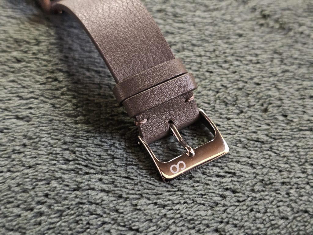
And they haven’t scrimped on the strap either. You get a handmade Italian leather strap which I can confirm is very comfortable and has none of that weird resistance that makes you feel like you’re trying to pin down an octopus, that you can get with tougher straps. It also has quick-release spring bars (always appreciated) and a signed buckle.
Overall, I’m impressed. In any review, you have to point out the flaws as you see them, but really there aren’t any dealbreakers here, and the niggles I did find are far from being showstoppers. Yeah, the back of the watch isn’t amazing, but it doesn’t need to be. The crown is fiddly but it’s a quartz watch so you’ll only be interacting with it now and again and I’d rather have no lume than bad lume.
The positives speak for themselves, though. The great colour, the excellent polishing, the sleek dimensions, and the well-considered blend of form and function make this an easy recommendation for anyone who wants a little understated class on their wrist.
4.0 out of 5.0 stars
Pros:
+ Classy design with signed elements
+ Excellent polishing
+ Sapphire crystal, 316L case
+ Swiss parts movement
+ Good strap
+ Good colour options
Cons:
– Two hand layout might be too minimal for some
– Crown can be a bit fiddly when setting the time
– Case back design isn’t the best
– No lume
Summary:
The Clássico is a credit to Corso because it shows a company that are clearly trying to give as much to their customers as possible while keeping it as affordable as they can and what they’ve achieved here is admirable. But beyond that, this is just a very cool neo-vintage inspired dress watch for a very tempting price.
JUST THE FACTS
Availability/Options: Here’s the bad news. Not only is this a limited edition (of 297 per colour variant) but Corso recently announced that they are retiring the range. So they won’t be releasing any new colours. Annoyingly, the green version is sold out but there are still a few watches left in other colours. Don’t sleep on it though as these will sell out.
Brand: Corso
Model: Clássico
Style: Dress
Case Size: 39mm
Movement: Quartz Ronda Caliber 762e
Material: 316 Stainless Steel (hardened)
Lug Width: 20mm
Band Type: Leather strap
Price: £202